

Mor mutfak, doğru renk seçimi ve doğrulanmış denge ile uzun süre memnun edecek ve iyi bir ruh hali verecektir. Sadece bu aralığın renklerinin hangi renklerle birleştirilebileceğini ve nasıl uyum sağlanacağını bilmeniz gerekir.
Makalenin içeriği
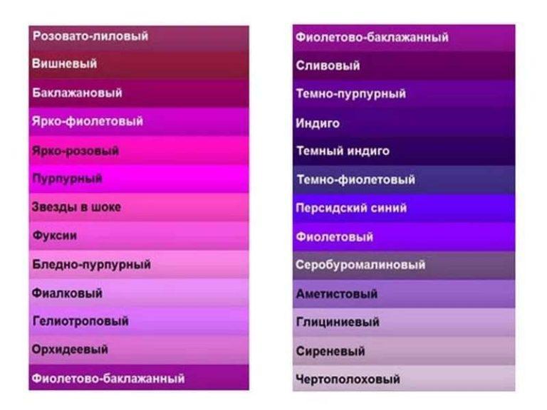
Mutfak iç mekanında mor hangi renklerle birleştirilir?
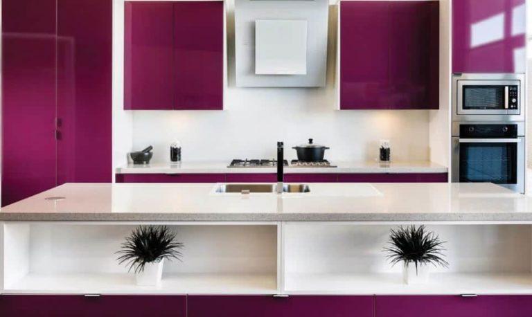
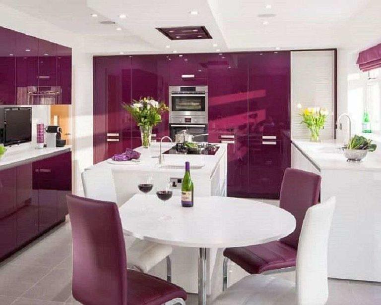
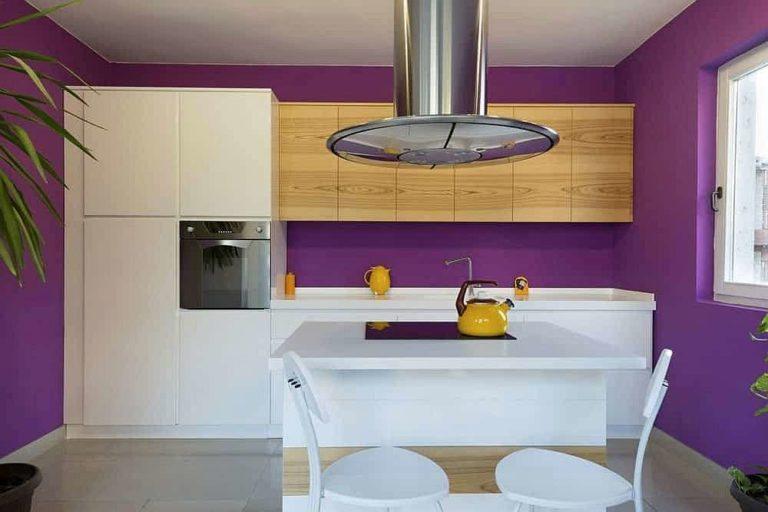
Mor parlak ve etkileyici bir renktir. İç mekanı uyumlu hale getirmek için "solo" renk yalnızca bir tane olabilir. Mor aralığın parlak ve doygun bir tonunu kullanmak istiyorsanız, diğerleri nötr (beyaz veya gri) veya açık, bulanık olmalıdır. Onlar sadece arka plan olmalıdır. Yaklaşık olarak aşağıdaki fotoğraftaki gibi.
Bu rengin en parlak tonları bile kombinasyonlar için çok zordur. Bu renkle iç mekanı aşırı yüklemek kolaydır. Bunun olmasını önlemek için mor olmayan her şey gri, beyaz, bej ve tonları olmalıdır.
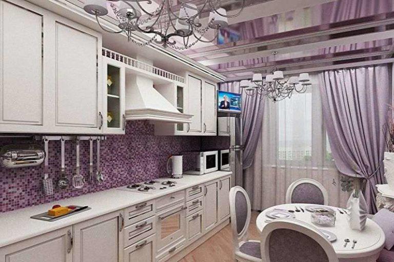
Yine de aynı aralıktaki çok açık tonları kullanabilir veya kombine edebilirsiniz. Örneğin, aşağıdaki fotoğrafta olduğu gibi açık grimsi bir patine ile açık yumuşak pembe. Garnitürün rengi beyazdan neredeyse fark edilir derecede farklıdır. Sadece bir miktar pembemsi leylak vardır. Lila duvarları vurgulayan ve iç mekanı uyumlu hale getiren şey budur.
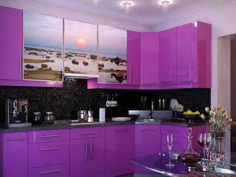
Bu örneği takip etmek istiyorsanız - parlak duvarlar ve siyah tezgahlı hafif mobilyalar yapmak için, cephelerin rengi duvarların rengine göre alınır. Soğuk bir gölge olacaklarsa, cepheyi aynı renk temelinde yapın, ancak çok fazla aydınlatın.
Temel renkler dışında hangi renkler eklenmeli
Genel olarak, beyaz ve gri dışında, mor ve leylak yeşil (çimen) ve ahşap rengiyle iyi bir şekilde kombine edilir. Zemin, açık renk değilse, "ahşap" bir renk yapın. Eksik olan sıcaklığı katar.
Ve yeşillik daha çok çiçek şeklinde bulunur. Çok nadiren birkaç yeşil ekleme yapılır. En ufak bir aşım, uyumlu bir iç mekanı bile tam bir kargaşaya dönüştürür.
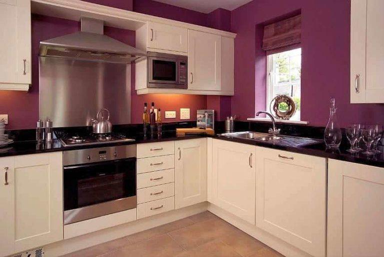
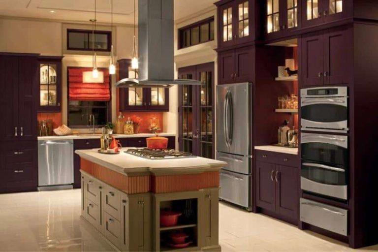
Siyah da ek olarak ifade edilecektir. Çok fazla olmamalıdır. Siyah renk dikkat çeker, kendine çeker. Yukarıdaki ve aşağıdaki fotoğrafta gördüğümüz budur.
Dikkat edin: ne kadar az siyah olursa, iç mekan o kadar "açık" olur.
Bu, mora eklediğiniz tüm koyu renkler için geçerlidir. Resmi güçlü bir şekilde koyulaştırır ve vurguları kaydırırlar. Leylak veya moru tercih etmek istiyorsanız, koyu renk hiçbir şey eklemeyin. Koyulaştırma, bu renkle çalışırken yapılan en yaygın hatalardan biridir.
Ne kadar mor çok fazla mor
Daha önce de söylendiği gibi, mor parlak ve göz alıcı bir renktir. Ancak baskın hale getirilemez, yani çok fazla olmamalıdır.
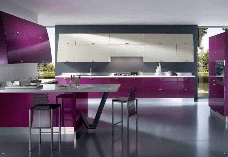
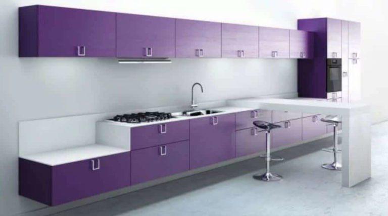
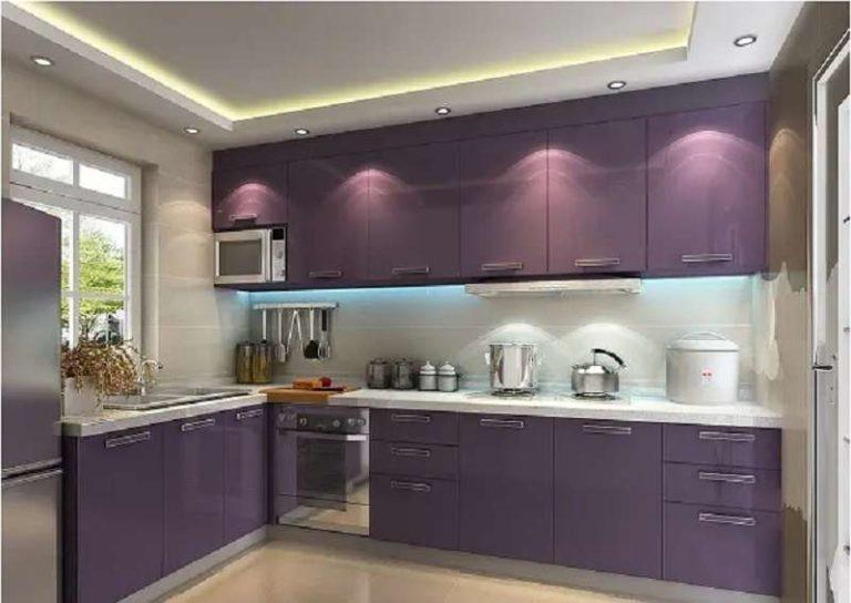
Mor bir garnitür veya mor duvarlar yapabilirsiniz. Bunlara ne ekleyebilirsiniz? Aynı renkte sandalyeler veya pencerelerde aynı aralıkta tekstiller - daha fazlası değil. Diğer - nötr renkler - leylak veya mora ayıracağınızdan daha fazla yer kaplamalıdır. Açık leylak rengi olsa bile.
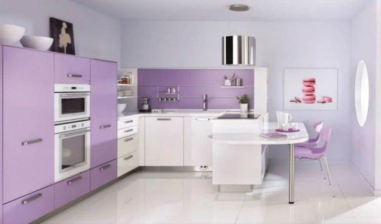
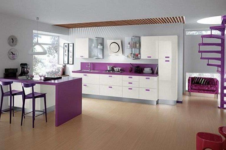
Yukarıdaki fotoğraftaki örnek. Bu standart olmayan bir çözümdür: renkli bir tavan yapılmıştır - daha koyu mobilya döşemeleri ve iç mekandaki bazı detaylarla gölgelenen açık mor. Diğer her şey beyazdır ve sadece zeminin sıcak sarımsı bir tonu vardır. Ve masanın tabanı hafif bir fıstık tonuna sahiptir. Atmosferi daha rahat hale getiren, cephelerdeki beyazın saf tonunu yumuşatan odur.
Küçük mutfaklarda mor nasıl kullanılır?
Küçük bir mutfak için bir iç mekan planlıyorsanız, bulanık pastel tonları kullanmak daha iyidir. Parlak ve doygunluk için alana ihtiyaç vardır, aksi takdirde zaten küçük olan hacmi "sıkıştırırlar".
Küçük bir mutfakta sadece kulaklığın kapılarını leylak yaparsanız, büyük bir pay kaplayacaktır. Diğer renkler için fazla yer kalmayacaktır. Tüm mobilyalar koyu ve parlak olacaksa, oda daha da küçük görünecektir.
Bu, geniş alanlarda bile mobilyaların bir kısmının beyaz yapılmasının nedenlerinden biridir. Mutfak mobilyalarının alt veya üst kapaklarının bir kısmı renkli, bir kısmı ise beyaz, gri veya bej renklidir.
Bir başka nokta: mor ve leylak sadece yeterli ışıkla güzel görünür. Doğal veya yapay olabilir, ancak bol miktarda olmalıdır. Bu aralıktaki açık tonlar veya az sayıda ayrıntı bile parlak aydınlatma gerektirir. Kendiniz bakın - her fotoğrafta ışık mor kısımda yoğunlaşmıştır. Nerede olursa olsun: mobilyalarda, duvarlarda veya tavanda.
Mor hangi stiller için uygundur
Lila bir mutfaktan bahsettiğimiz anda, hayal gücünde Provence tarzında bir resim belirir. Ancak ülkemizde o kadar popüler değil ve bu tarzdaki mobilyalar çok fazla değil. Siparişe göre yapmak pahalı olacaktır - çok fazla ayrıntı, daha yüksek iş karmaşıklığı, daha yüksek fiyat.
Mor ve lila modern tarz için harikadır. Hem mat hem de parlak versiyonları vardır. Ve cephe ne kadar sade olursa, renge o kadar çok dikkat çekilir.
Parlama ve yansıma nedeniyle parlak cepheler mekan algısını bozar. Küçük odalar daha büyük görünür. Ancak mobilyaların daha fazla özen gösterilmesi gerekir. Özellikle de parlak doygun bir renkse.
Mat mutfak cepheleri bakım açısından talepkar değildir. Lila, mor, erik rengi çarpıcı görünüyor. Net basit çizgiler, mobilya üreticilerinden özel beceri gerektirmez - sipariş üzerine bile, bu tür cepheler çok pahalı olmayacaktır.
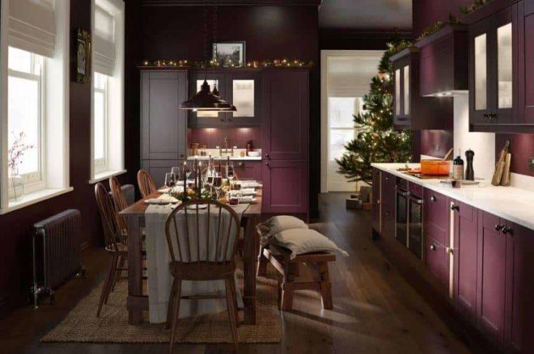
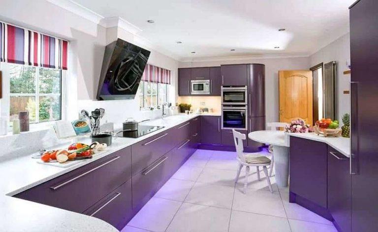
Daha parlak ve standart dışı çözümlerden hoşlanıyorsanız, mor mobilyaları duvarlarda sıcak tonlarla birleştirin.
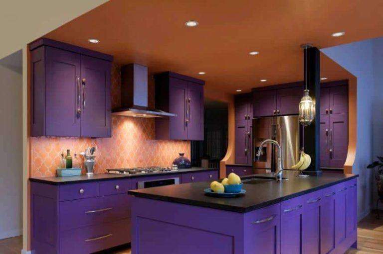
Yukarıdaki fotoğrafta tavan duvarlarla aynı renktedir. Ancak çok fazla ışığa ihtiyaç var. Tavan aydınlatmasına ek olarak, çalışma alanının ve her birinin aydınlatılması gerekecektir.
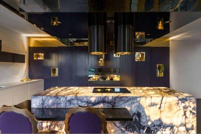
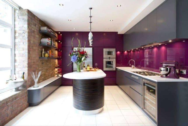
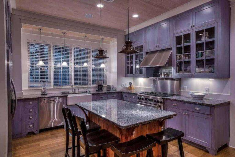
Yukarıdaki fotoğrafta, iç mekan art nouveau ve lüks tarzın eşiğinde. Daha doğrusu, bu tarzların bir karışımı. Koyu mor tavan ve cephe, diğer tüm nesnelerin açık ve beyaz renk denizini telafi ediyor. Bunun istisnası, aynı renkte damarları olan mermer masadır. Renk seçimi için temel teşkil eden mermerdi.
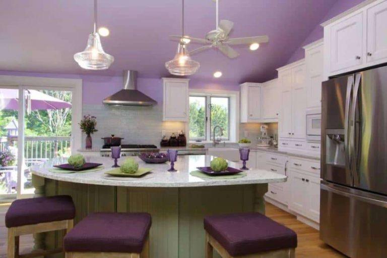
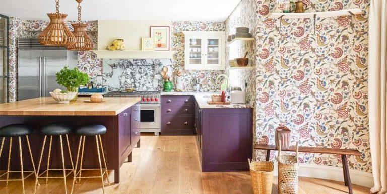
Bir sonraki fotoğraf daha az ilginç bir seçenek değil, ancak farklı bir tarzda. Aynı zamanda "lüks "e daha yakın, ancak Provencal notaları var.
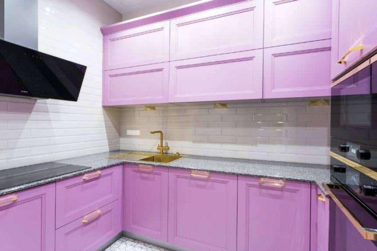
Burada da belli bir country tarzı hissediliyor. Doygun renk çelik grisi ile seyreltilmiştir. Genel olarak, bu kombinasyon her zaman kazanır. Lila-mor aralığındaki herhangi bir renkle. Bu, leylak rengine pembe-kırmızının da eklendiği nadir bir durumdur.
İlham için fotoğraf
")


