

The right use of purple color in the interior is not so easy. It is very active and bright, so you need to choose not only the right colors, but also be careful with tones and even textures.
Contents of the article
Purple color and its shades
Purple is obtained by mixing red and blue colors. Depending on the predominance of one or the other color, we get different shades – either warm or cool. In the palette of lilac shades there are such popular colors: purple, magenta, blackberry, eggplant, indigo, amethyst, fuchsia, lavender and more than a dozen others. Even if you decide to make a monochromatic design – only in purple colors – it will not be boring, as many different shades, not bad complementing each other.
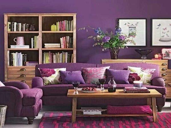
Purple color “in its pure form” – bright and saturated. He brings notes of grace, wealth, stability. But to use it in the interior as the main color is too risky. It turns out to be too “heavy” environment. Stylish, elegant, but… you want to run quickly and far away.
This does not mean that purple color in the interior should not be used. If you like it, it is very much worth it. Just need special techniques, dosed use of bright, saturated colors, more give preference to light or pastel tones and shades.
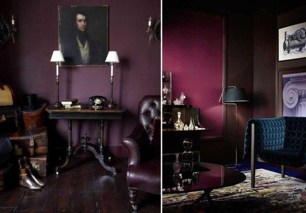
The main rule – with dark and saturated shades should be careful, they in our latitudes look too gloomy. Few regions of our country can boast an abundance of sunny days “not in summer”. Saturated purple or lilac – too gloomy for cloudy weather. In addition, for typical apartments with low flows and not too spacious rooms, they are too flashy. So you will most likely have to choose from light, pastel or maybe bright.
What colors are combined with
White, black and gray – these colors are out of competition, as they are compatible with any color. This is a base that you can’t go wrong with. In the purple range, there is such a shade – purple. It has more red in it, so combine with it other shades. The most successful combinations of purple with other colors are as follows:
- Red and blue. Can be present together or separately. Purple color in the interior is better to combine with crimson and coral and other pure red shades. Blue should be muted or light. Purple wins next to bright pink and fuchsia, muted shades of red, but blue should be “pure”. Not necessarily bright, but without an admixture of gray.

- Green. Of the green range is best combined purple turquoise and its shades, the color of the sea wave. Purple is combined with malachite, olive, green apple color.
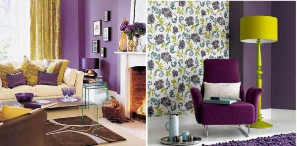
- Yellow. Purple is better to combine with pure yellow (egg yolk), other pure tones are also suitable. It benefits from combinations with the color of gold, copper, brass. For purple, it is better to choose ochre – yellow-orange tones.

- Beige. It is best to add sandy and cream. They will perfectly highlight and slightly “muted” the dominant violet color.
If we talk about combining with wood, then the breeds of warm – yellowish and orange – tones will look great. Oak in its natural color and dark shades such as mortared oak, wenge, etc. are also suitable. The texture and color of the wood will balance even bright, active tones. If there is more than one, they will not be too shouty. So in rooms with wooden finishes purple is very appropriate.
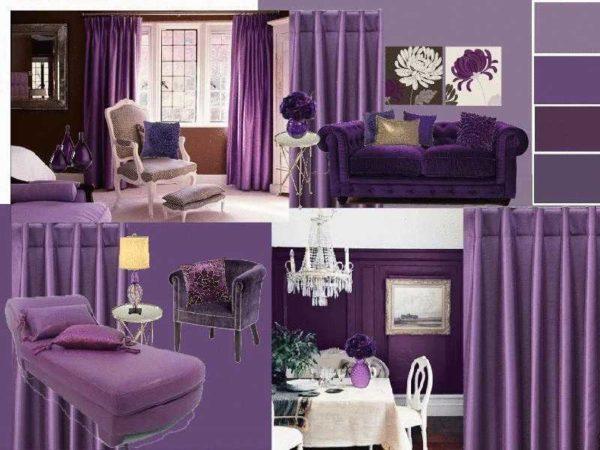
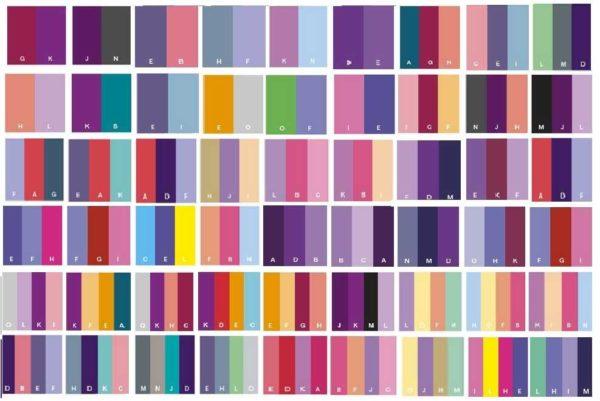
Tables combined with purple colors
All of the above clearly illustrate the tables of color combinations. They allow you to visually assess what you expect when decorating the interior with the use of this combination. In such tables there are combinations of two, three and four colors. They can be friendly (are next to each other in the spectrum), contrasting (at opposite ends of the color wheel), or they can simply be different shades of the same color.
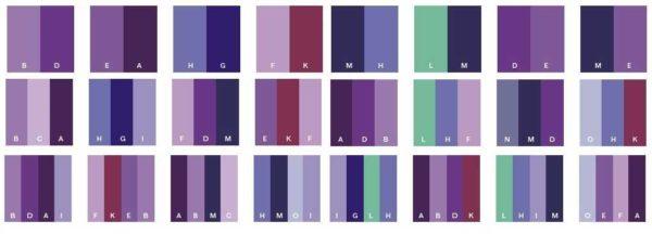
For independent development of the interior, it is better not to take more than three shades. This does not mean that only they should be present in the design. To them in any amount are added basic – white, black, gray, wood.
From white and “wooden” can not go anywhere and they are present almost always. This is the floor and ceiling, window frames and some other elements of decoration and design. Gray and black are not in all interiors, but they are also frequent guests. So even if you choose a double composition from the table, “in real life” you will have four to six colors. More than enough for one interior. Even more – and there will be a motley hodgepodge.
If the created interior will seem to you too restrained, it can easily be refreshed with a couple of bright details that can be easily changed: pillows, curtains, paintings, vases, other small things. It is these “little things” that give life and sound to the design. And with their help it is easy to change the “mood” of the room.
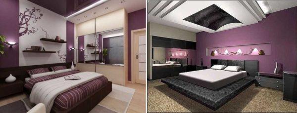
Rules of use
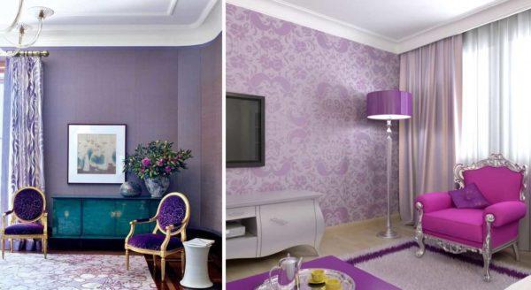
Purple can be used in the interior of rooms of any purpose: in the living room, bedroom (adult and child), in the kitchen, in the bathroom. If we talk in general, it is desirable to complement it with shimmering textures, alternate satin, glossy, matte surfaces. Very well it is shaded by metallic shine, mirrors and bright, but “warm” light of lamps.
What should be a lot in a purple interior is light. Warm lighting advantageously shades deep tones and emphasizes the color of “diluted” shades.
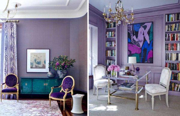
This is a very versatile color. It is appropriate in a classical interior (matte surfaces, calm shades), ethnic – like “Provence” – light, pastel tones, in modern and fashionable interiors like high-tech, pop art, art deco, minimalism (bright colors, shiny surfaces). This is such a universal color. But designers use it cautiously: it is too demanding to combinations and materials. It is necessary to accurately and carefully select not only colors, but also the degree of brightness, and the texture of the surface.
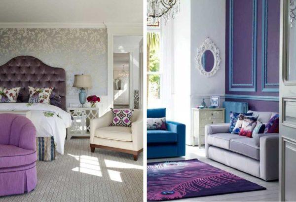
As the main color of the interior
If you are very fond of purple and want to use it as the main color, it is better to choose light or pastel shades. Saturated and bright as the main ones are too “heavy”. As additional or accent colors they are ideal, but in large quantities they are too “pressing” and oppressive. Dark shades, of course, can be diluted with yellow and softened with wooden products. The interior will turn out stable and solid, but will still be somewhat “heavy”.
Lighter colors – light purple, wisteria, salmon – diluted with white paint – do not give such an effect. Pastels (muted gray) also do not “load” the space so much. Here they are good as the main color.
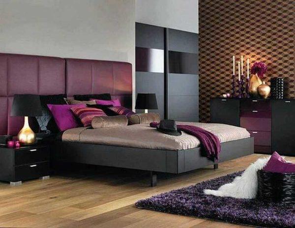
Depending on the chosen combination can turn out different mood design: from calm and restrained, to mischievous and bright. It depends on the selected colors-components. If you complement the interior with calm gray, beige, white, you will get a restrained interior. Not cold, but just restrained. With bright accents (and there are many such combinations, much more than calm) you get a “warm” and active atmosphere. In the children’s room or kitchen, even in the living room, it is very good, but for the bedroom this option is not suitable. Although, if you need energy, then why not.
As an additional
A popular technique for interior design today is an accent wall. For these purposes, purple is what you need. Bright, self-sufficient, it does not remain out of attention, and emphasizes the advantages of the main color. This technique is used in bedrooms, living rooms, kitchens. Practically in any living or technical room of an apartment or house. Under the question of such a design in the hallway and corridor – they are usually too small in area and “load” them is not the best solution.
As an additional, lilac and its shades can be used in furniture upholstery, curtains, carpets. This is a great way to revitalize the room initially decorated in white, beige or gray scale.
To purple, lilac sofa or banquette add a couple of bright cushions and other small details of turquoise or not too bright red, and the interior will be aristocratic, stylish, but at the same time, clearly not boring. If you add yellow, it will be even more joyful and bright. There is little resemblance to aristocratic restraint, but the expressiveness and unconventionality of the inhabitants is clearly felt.
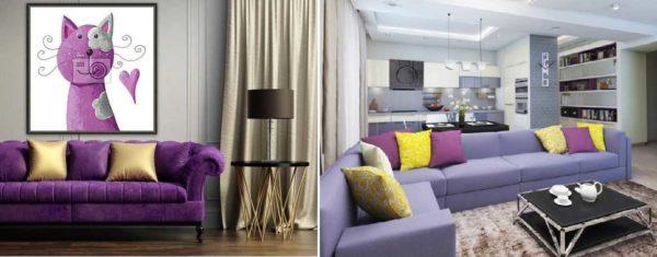
And, as you can see, this technique works both with saturated purple and not too bright, muted lilac. Only the tone of yellow is different. This is also worth considering . And also note that the velvety texture wins. This is visible even on the photo, and “in real life” so simply catches the eye.
Purple accents
As accents, purple is ideal. He “makes friends” with beautiful shades of red, blue, green, yellow gamma. If you use them as accents, you can “revitalize” any decor. And you can create both home and salon environment. It all depends on the style of additions.
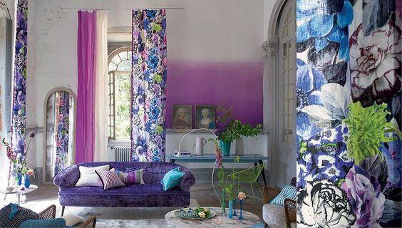
Just as velvety surfaces in furniture upholstery look better in lilac or violet, also soft muted shine of chalk or mother-of-pearl is appropriate in or around add-ons. Slightly shiny surface of the frame or silk cushion, favorably shades “simple” fabrics and matte surfaces.
Where to use
Purple color looks good in any room. But when using the colors of this range, you need to be careful not only to select the color, but even the shade. The extent to which it will be light or bright.
Similarly important are the shades of all other colors in the interior. The slightest mismatch introduces dissonance and “scratches” the eye. Textures are also important. Matte, velvet, glossy, pearl. All these nuances significantly change the perception of any shade of this range. Consequently, one has to pick up all other colors/textures/shades as well. That is why designers do not like to mess around with this range – they are too demanding. It takes a lot of time to pick out the little things.
In the bathroom
In the bathroom purple does not give the formation of a “sterile” interior. Even if the room from floor to ceiling is finished with tiles with a glossy surface. Warm shades do not give warmth and coziness and in such a room you want to be in.
Combinations are described above: the main colors are white, beige, light shades of the same range, light gray. Accents can be arranged with red or small black fragments, other bright or not very combined colors. If you want more glamor and pomp, you can add gilding, copper. Metallized details will give more technocratic.
In the kitchen
Another technical room in our apartments and houses is the kitchen. Purple color in the interior of the kitchen is not very common, although it looks modern and relevant. With the use of glossy facades and saturated shades, it can be a high-tech style or close to it modern style. Accents in this case are set either black or metallic.
Soft lilac shades in matte facades are appropriate in Provence, classic. There are classic combinations: with white, yellow, olive. In such interiors you can often see floral ornaments and prints. They give the kitchen a cozy feel.
You can use lilac and purple in the kitchen in the design of the apron or accent wall. It looks great with panels with plant motifs. Photos too “load” kitchen room, and stylized flowers look very even stylish.


