While still planning the renovation or finishing, it is necessary to think about what will be the style of the interior. In accordance with it will need to select methods of finishing, materials and colors.
Conteúdo do artigo
Current trends in recent years
To say that the historical styles in the design of premises now unpopular can not be. But gradually the accents are shifting. After a busy working rhythm at home want space, simplicity, convenience. And numerous, albeit chic, elements of decor tiresome. They, of course, create an atmosphere of coziness, but very stuffy. Therefore, gradually baroque, roccoco and other chic styles give way to minimalism, high-tech and others – interiors modern, more functional and easy.
Modern style in the interior
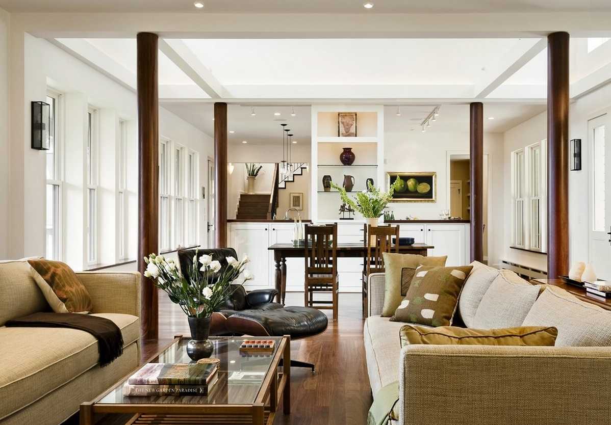
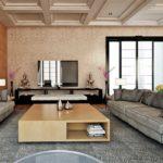
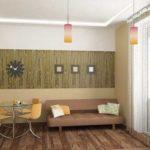
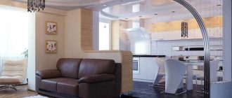
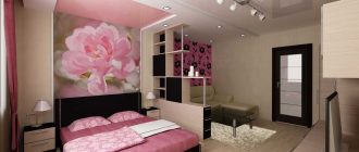
Like most of the current trends, the modern style of interior design involves a minimum of furniture and accessories. The main task is to create an interior with a sense of uncluttered space, light and unobtrusive. Hence the choice of items: they are functional, the lines are laconic. This style is for those who are tired of the variety of complex forms.
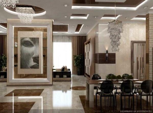
Characteristic color scheme – neutral tones. These are shades of gray, beige, white and light brown. All the decoration of the walls, floor – only a background for furniture and accessories. Hence the methods of finishing. Walls can be plastered or wallpapered, but their surface is smooth, without a pronounced texture. When decorating rooms in modern style on the walls should not have any pronounced textures and even barely noticeable drawings. It can resemble silk, velour, be just plain matte. Perfectly flat surface without imperfections.
- The colors are not bright, the walls are smooth.
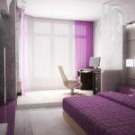
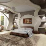
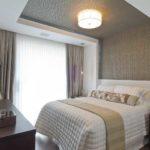
- Bedroom in a modern style, predominant colors brown gamma
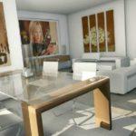
- Modern style of the interior assumes a small number of items
- The absence of unnecessary details – a key point
On the floor usually put laminate and, as a rule, light colors. Put more parquet, but the boards are laid flat, without patterns. It is acceptable to use a carpet with a short pile. Another option for flooring – poured floors, and again – one-toned matte, non-bright colors.
If you leave the interior in this form, it will be too calm and inexpressive. Revitalize it accessories and decor. They are very few, choose them carefully, often the decor is functional things: shelves, racks, furniture of interesting shape. Colors – saturated, shapes are simple, no patterns or floral, plant motifs. Live plants look interesting against such a background. Their greenery stands out brightly, bringing the necessary color accent.
- If there is a color accent, then the color is the same
- Furniture and textiles for it are the main accessories
- Strict lines, evenly colored surfaces, few details
- With a slight touch of 60s style
Ceilings in modern design are no less noticeable part of the interior than, say, the walls. They can be with any number of levels, made of plasterboard, plastered or combined with stretch ceilings. In this style there is usually a chandelier, but it has an unusual shape, suitable for the style – made of glass or with a metallized surface. Plafonds – strict forms without embellishments and curls.
Furniture for the interior in modern style has the right proportions, even or smooth, slightly rounded, lines. It is practical and comfortable. Upholstery – monochrome with a smooth coloring. It can be fabric, leather – natural or artificial. In the choice of textiles for furniture, you can add a few bright accents, breaking the monotony of the design.
- Ceiling and backlighting – two ways to revitalize the picture
- Curved lines, but not curls – this is acceptable
- Textiles, furniture, lighting – an interesting effect
- Characteristic colors for modern style – white, beige and their combinations and shades
For windows, textiles are also chosen for the most part evenly colored. There may be geometric patterns, alternation of matte and shiny threads, but without plant motifs. For modern interiors are suitable classic curtains on eyelets. They create measured, calibrated folds, which perfectly fit into the style. Good are also Japanese, Roman, can be used roller blinds.
Modern style, by the way, is easily transformed into close in spirit. It serves as a kind of basic for other directions in the same way. You will get tired of monotony, want something more daring … a few paintings on the walls, a certain number of bright accessories, upholstery will change to black and white type “zebra skin” or just striped. It turned out to be art deco style.
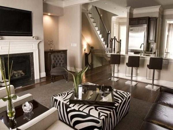
If you add metal in the interior – lamps with open fittings, furniture equipped with shiny inserts, put it on stands like tripods, vases in the form of tall and narrow flasks, add a cityscape on the wall – you get the style of techno.
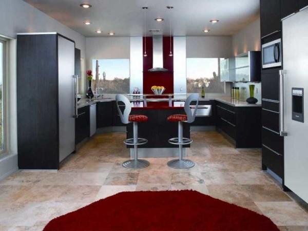
High-tech
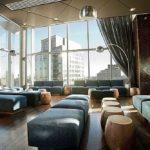
This style of interior, which emerged near the end of the 20th century. It reflects the penetration of high technology in our daily lives. It is inherent to him strict rapid lines, smooth surfaces without drawings, simple shapes. The most characteristic features of high-tech style are the combination of metal and glass in many interior items and the presence of “industrial” motifs.
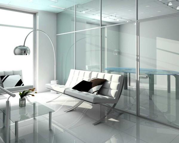
The realization requires large spaces and there are no partitions. Or rather, they are organized by folding, sliding structures that only zoned space, not dividing it into separate rooms. Glass partitions in a frame of shiny metal – aluminum or chromed steel – are very typical. The same motifs in the furniture: legs made of shiny pipe.
The walls are monochrome, smoothly painted, without texture or ornamentation. So here, too, the decoration is mostly plaster, and if wallpaper is used, it is absolutely smooth. The color scheme of the background – walls, ceiling and floor – is not diverse: white, light gray, beige.
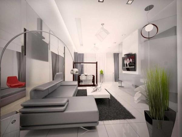
But the furniture can be painted in a bright color. It is the center of the composition. In this case, the lines of furniture are simple, upholstery – monochrome. But this does not mean that there are no unusual shapes. On the contrary, furniture for interior design in the style of high-tech can be very unusual shapes – futuristic, technocratic.
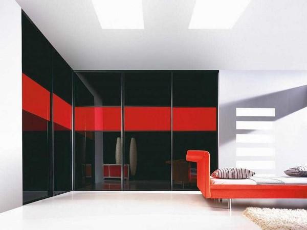
Accessories or there are no accessories, or they are strict and laconic. Lighting – bright and zoned. Chandelier in the center is absent in principle, and illumination “gets” a large number of lamps on the walls, ceiling, characteristic table or floor lamps.
Ideal option – glossy or semi-glossy stretch ceiling. It reflects the glare of light, which brightens up the monotony of the environment. The same glare plays on glass and shiny metal surfaces.
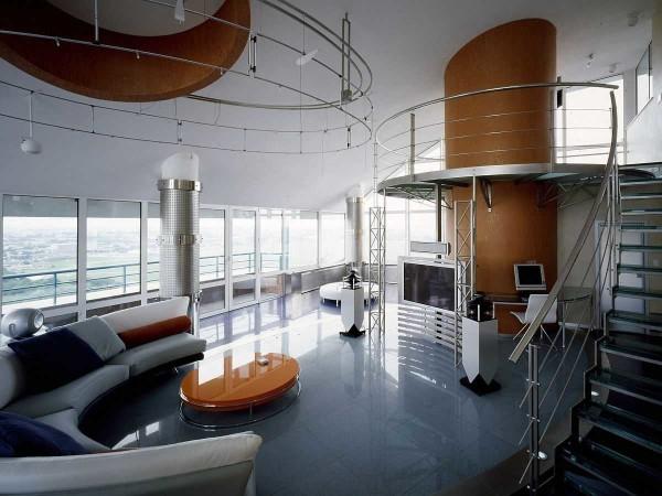
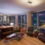
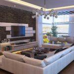
As you can see, in its purest form, the style is quite cold. Not everyone likes it, although it can be softened by a monochrome shaggy carpet and suitable textiles. But still, it turns out to be more “industrial” environment than home. That is why there are softer interiors of “domesticated” high-tech. They contain its elements, but in combination with softer and more varied colors, wooden furniture and the same warm tones in textiles. Some of them are presented in the photo gallery.
Minimalism
Interior style “minimalism” is also “born” from the end of the last century. Its characteristic feature is the absence of any unnecessary details. Only the necessary. The main color – walls and ceiling – white, emphasized by contrasting black, brown or dark gray. There are other colors, but these are no longer characteristic features, but variations. From the above-described high-tech it is distinguished by the use of wood and products made of it, although wood is not a mandatory attribute. Just against the background of light-colored walls, it stands out especially clearly, undoubtedly attracting attention.
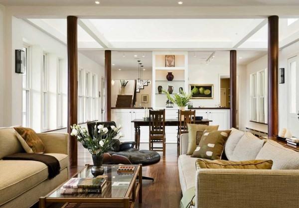
The basic rules: large spaces, conditionally zoned by lighting, slightly marked by partitions. Large windows, a lot of light, but it is not sharp and bright, as in hi-tech, but softer and diffused. To create this effect, matte surfaces are used. They do not reflect light, but diffuse it.
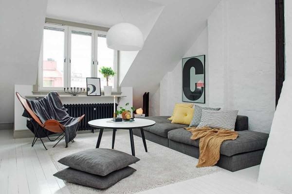
In lighting, zoning prevails. There is usually no chandelier, there is a large number of lamps of simple shapes. Here, actually and all. Furniture – simple, monochrome, no ornaments and flashy elements. Spaciousness, plenty of air, uncluttered interior. This is minimalism.
Ethnic styles
Though good ultra-modern styles and trends in interior design, but not for everyone. Too cold and refined. There are always romantic natures, for whom such utilitarianism and rationality is unacceptable. They prefer a more cozy environment. Such an opportunity provides styles of ethnic orientation. They are good for their versatility, which allows you to choose a style to suit your own taste.
Provence in interior design
Style is named after one of the southern provinces of France and belongs to the direction of “country”. Provence is an agricultural area famous for its vast fields of lavender. And interiors in the Provence style are rural, pastoral, simple, with wooden elements – painted or artificially aged.
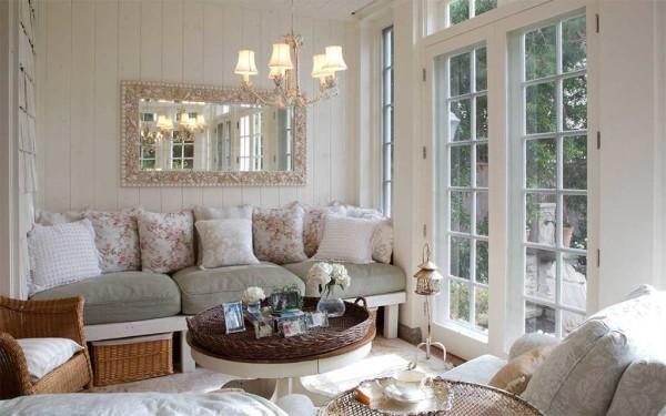
The main colors – white, possibly with a gray or beige tint. In the design – dim pastel shades, as if faded under the bright sun. Soft blue, a little lilac, pale pink, light green, yellow. As a color accent – lavender and the color of the southern sultry sky – bright blue, you can meet warm flecks of ochre.
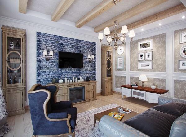
If you need a Provence style in the premises – wallpaper is not for you. Walls – plastered, and the plaster is rough, with a clearly pronounced texture. Wooden walls fit in well. Can be whitewashed, painted or in natural color. But the coating without gloss – matte, and better – aged surface with a clearly visible texture.
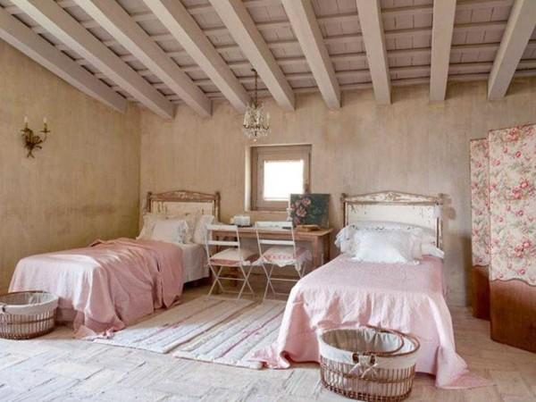
Wonderful looks brick wall, simply whitened or in natural color, without plaster. In general – rustic, light and, slightly, country style. Great for wooden houses, but in the refined form is good and in apartments.
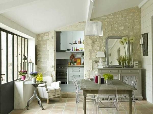
Furniture – simple wooden or painted. Tables, chairs, chests of drawers are made of wood. There are forged elements – on the walls shelves for flowers, legs for the table. Upholstery of sofas and armchairs – or monochrome, similar to linen, or with floral motifs. A lot of textiles – pillows, homespun bedspreads or rugs. At all this, one should not forget that this is rural France. The items are simple, but not crude, some even with a certain degree of elegance.
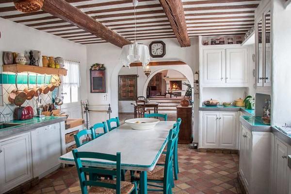
The ceiling is wooden or plain white. A characteristic feature – beams under the ceiling. Unfortunately, in the interiors of the style of Provence illumination of ceilings, so loved by many, is practically not used – does not fit into the concept. But perfectly suitable wrought iron chandelier, which can be on a chain down from the beams.
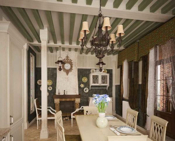
Separately it is worth talking about the windows. They are, of course, large from floor to ceiling: south, heat, it is necessary to ventilate. Curtains – light, classic models – white curtains and monochrome or colored light curtains. Colors – not bright, pastel.
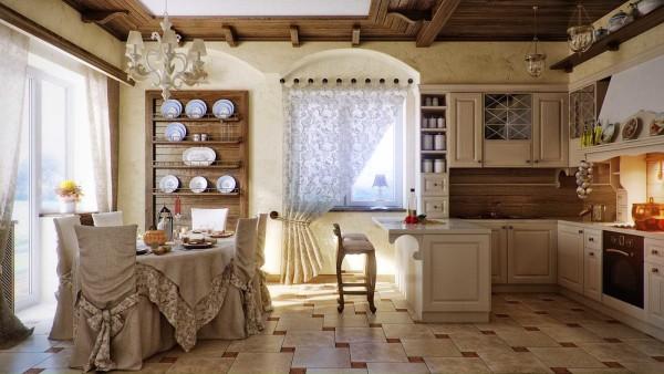
In general, there is no motley. On a white or other light background brown tones of wood and some other one, maximum and occasionally – the second color.
Another interesting style for creative individuals – loft – is described in this article.
Scandinavian style of interior – naturalness and plenty of light
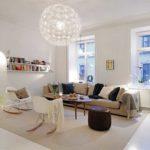
If you like simple interiors, but modern trends are too cold, your choice is Scandinavian style. With the general similarity, it is more “home” and warm. A wider range of colors is used – all natural shades, no “acid” or exaggerated. The walls are white or milky white, creamy shades may be used. Other colors from the “natural” palette – browns, ochre, greens, blues – colors of the sky or sea waves.
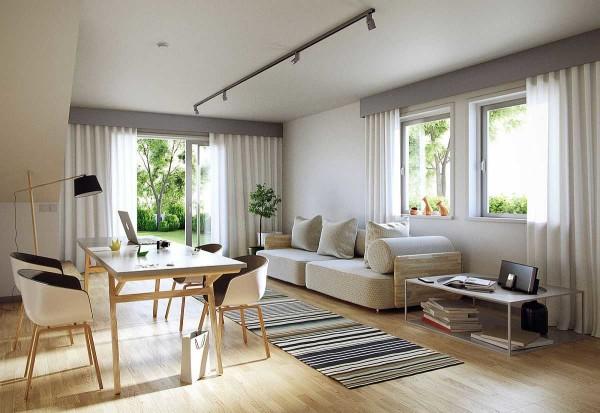
The harsh climate has accustomed to love the feeling of warmth that gives wood. It is on the floor, furniture is made of it, walls are paneled. The most common species are pine and birch. Their wood has a light color, well-defined texture, which on a light background draws attention to itself.
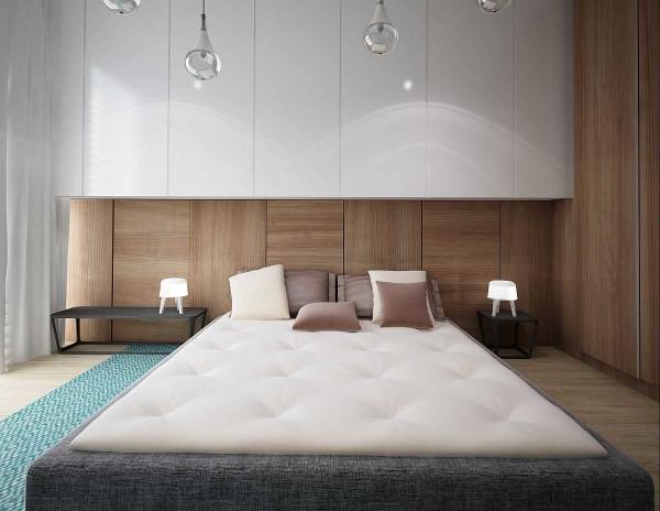
On the floor is usually a plank or laminate. There is no excessive parade, the furnishings are laconic and simple. Ceilings are ordinary, plastered white or wooden, natural or whitened. Stretched multi-level systems and complex lighting are not typical for Scandinavians. They are generally alien to parade and pretentiousness. Simple, comfortable, high-quality things – yes, but complex decoration – no. All this is reflected in the interior style.
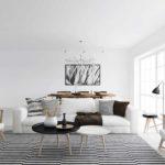
- Very close to the modern style, but with a great variety of colors and textures
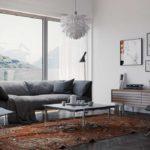
- Even the old carpet – cozy and warm – has found a place
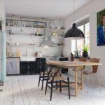
- Scandinavian style kitchen – lack of parade is the main feature.
- Warm plaids and pillows – one of the attributes of the style

