Developing the interior of a small room mainly adhere to two tasks: rationally use every centimeter or even millimeter of available space and make it beautiful and harmonious. To accomplish these tasks there are many ready-made ideas, tested on thousands of rooms. We will talk about them.
Conteúdo do artigo
General principles and ideas
Regardless of the purpose of a small-sized room, there are general principles of their design. This is far from dogma, but adhering to these rules, it is easy to independently create a harmonious interior of a small room, and not to the detriment of functionality and convenience.
Styles for small-sized rooms
The very first thing you need to decide on is the style. So it is much easier to develop a design, select finishing materials, furniture, accessories. Small in size rooms can not be cluttered with objects, should not be in them and a lot of accessories. The more free space, the more spacious the room seems. Therefore, not all styles are suitable. The following will look good:
All of them are characterized by smoothly painted walls, clear lines, a minimum of details. All this will play into the hands of a small room. Read more about almost all of these styles here.
Escolha da cor
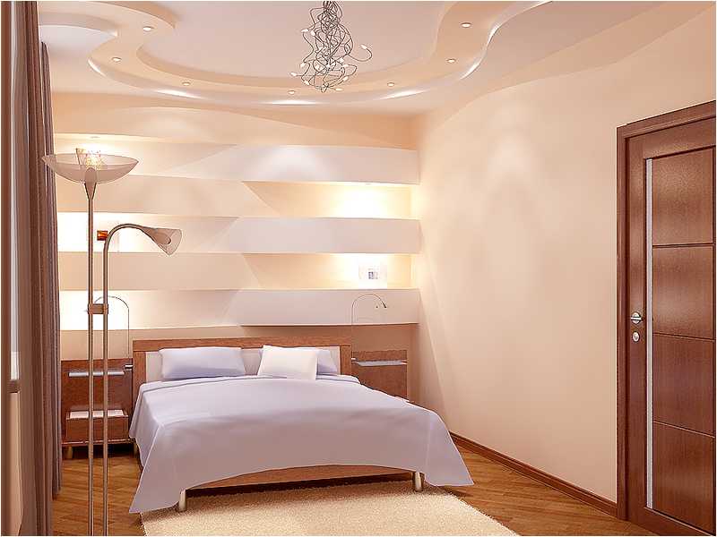
It has long been known that light colors visually enlarge rooms. Light colors are not necessarily white, although white and its shades are used very often. They make the interior lighter and weightless, especially in combination with light-colored floors and ceiling.
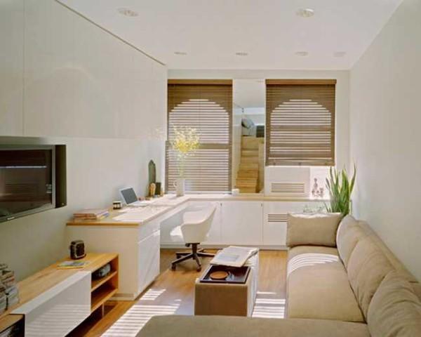
If you decide to make the walls colored, you need to remember the rule of three. Applied to color design, the essence of it is that to create a harmonious interior there should be three colors. The first is the base color, it can be a lot. Two additional can be in very small quantities. If we talk about design in small rooms, the base color is painted walls and they should be light. Furniture – or base color (maybe a very close shade) or one of the additional. Accessories and textiles – additional colors.
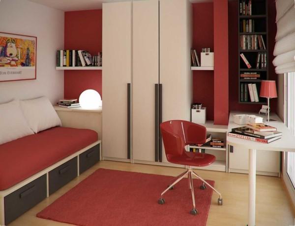
If you look closely at those photos that you find most attractive, you will find that they have three colors. It can look good and more saturated with different colors, but only a good designer can put everything together correctly.
And how to choose a trio of colors? There are tables of combined colors, which are used by designers, but you can be guided by your own taste or look at the photo. The most attractive combination can be realized in your room.
Ceiling design
Most often the ceiling is white. Not necessarily snow-white, often use some shades and tones. What you should not do – paint the ceiling in a dark or bright color. This can be used only in a very high room with excellent lighting, and it is better that the ceiling was glossy. Dark colors make the room look much lower. If you need to remove the “well effect”, this is a good way. In other cases it is better not to experiment, although with the right lighting can be not bad, but it also requires a lot of design experience.
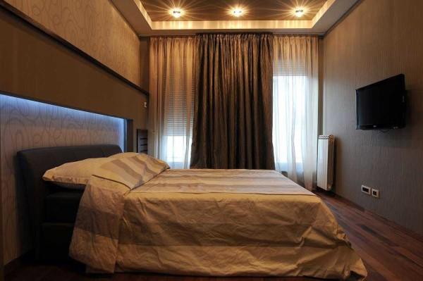
In rooms with low ceilings there are several ways to visually make them higher by playing with color and light. The first is to make the ceiling a tone lighter than the walls. In this case, the boundary between the walls and the ceiling is lost, which is perceived by us as a higher room.
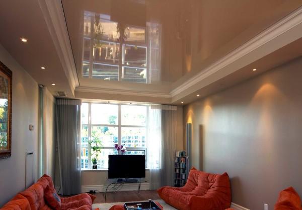
The second method is a glossy ceiling. The surface reflects the surrounding environment, which again deceives our vision. From modern technologies such an effect gives only stretch ceilings, but the choice of shades and degree of shine and reflection is wide. Only with gloss should be careful. It reflects everything. And what lies on the cabinets too. Therefore, in such a room should be perfect order.
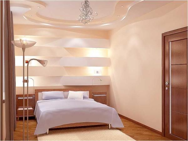
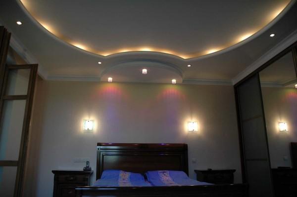
Third – illumination along the perimeter or directed from the walls – to the center. This option is usually realized on two-level or multi-level ceilings. This staggeredness itself also as if to lift the ceiling up, and with the effect of backlighting it is even stronger. Only conceiving ceilings with backlighting, do not create for small rooms too complex designs. They are good for large spaces, not for small rooms.
All these methods can be combined, which is often done. It is important not to overplay.
Floor decoration
The choice of color – light or dark – depends largely on the style, but there are some in which both options are acceptable. What then to choose? Orient on your own desires. If you want to get a sense of stability in the room, a dark floor is more suitable. If you need lightness – your choice is a light floor.
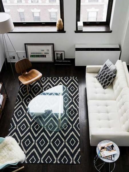
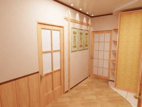
With the help of floor design, you can also achieve a visual increase in the room, but for this purpose, a floor of planks, laminate or parquet is suitable. Traditionally, they are laid parallel to the rays of light coming from the window. To achieve the effect we want, the flooring should be laid at an angle to the front door. This breaks the perspective and visually makes the room look bigger. Yes, this way of laying is more complicated and there is more waste when using it – not all the scraps can be reattached, but the effect is good.
Furniture
Small rooms require functional and comfortable furniture, and laconic forms with clear lines look better. To such a choice pushes and styles – they all require strict, simple lines.
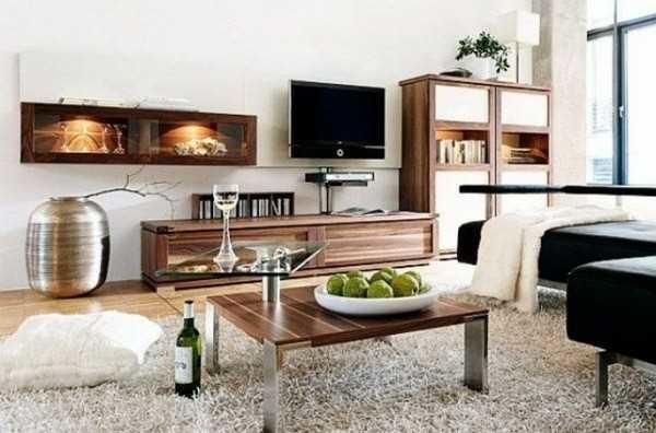
When planning, select furnishings so that horizontal surfaces are at different levels. This makes the interior more dynamic. If you put everything on one level, it will be too monotonous and flat.
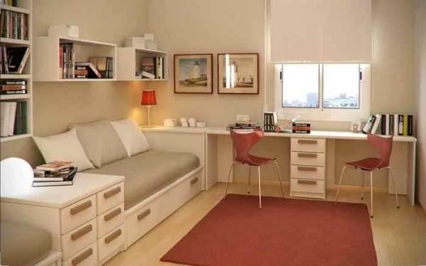
Another recommendation – do not load too much space. In small rooms it is necessary to put the necessary. It is desirable to avoid a large number of massive objects. If it corresponds to your idea, put furniture on metal legs. They seem to lift the object above the floor, creating interesting effects.
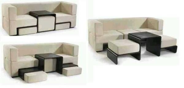
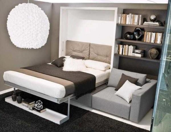
Increase the functionality when using small space allows furniture that changes its shape or purpose. It is also called “transformers”. Everyone knows well sofa-bed, armchair-bed. They have been used for a long time, changing only the appearance and mechanisms become more convenient. There is also a bed-cabinet (the sleeping place rises and hides in the body) and a considerable number of similar things (transforming sofa in the photo below).
The application of these rules is not mandatory, but it will allow you to develop a beautiful and harmonious design of a small room.
Repair of small-sized apartment (photo report) is described here.
Ideas for the interior of small rooms of different purposes
Now let’s specifically see how all of the above is realized in the design of rooms of different purposes. It is clear that there is a significant difference between the design of the living room, nursery and bedroom.
The only room in the apartment
In a one-room apartment, the room should be superfunctional. After all, it is used both as a living room and as a bedroom. First of all, it is worth thinking about sleeping space. There are several options for a solution. The most obvious and common is to put a folding sofa. There are different designs, but the essence from this does not change. The only disadvantage of such a solution – it is, after all, not a bed and sleeping on the sofa is not quite comfortable. Nevertheless, this is the most common option.
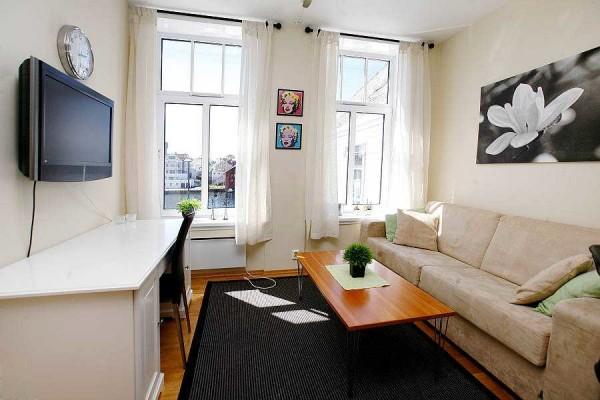
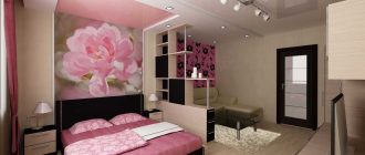
This option is acceptable if there is one person living in the apartment. If there are two people – it is not very convenient: someone wants to sleep, someone else does not sleep. In this case, try to separate part of the room with a translucent partition and behind it to place a bed. The remaining part is furnished as a mini-living room.
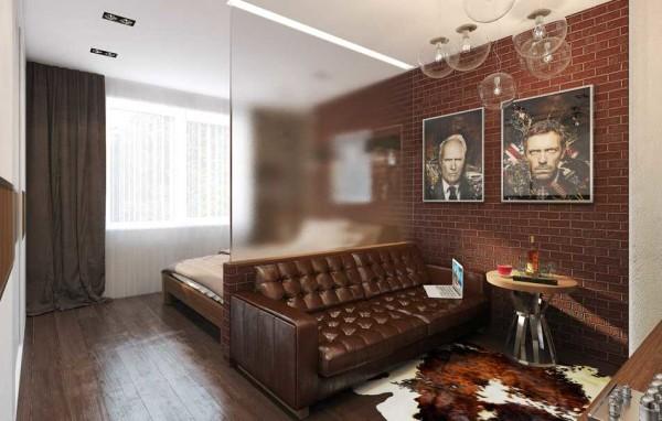
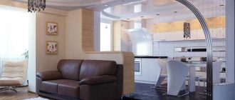
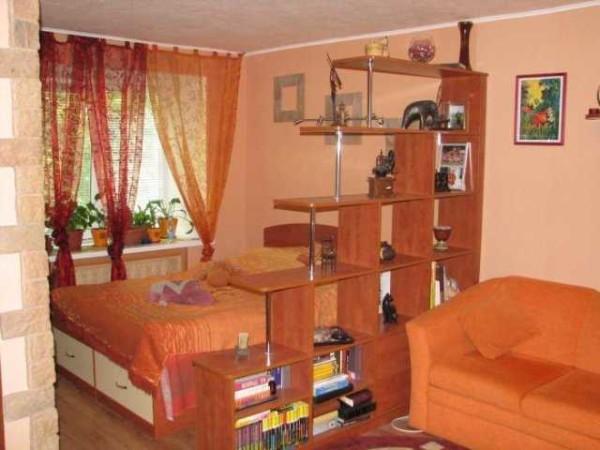
The partition can be made of any material. The only condition is that if it separates the area near the window, it must let in enough light. In the photo above, the room is divided by a translucent glass wall. With a clear separation, the space is not split. It remains whole. Another option is to mark the zone with a plasterboard openwork partition or make a partition in the form of shelves.
If you still want more privacy, there is an option with sliding partitions that work like doors in closets.
Read about sliding doors here, and in this article you can read about accordion and book folding doors.
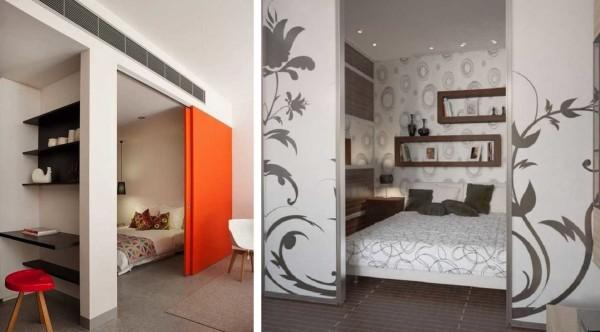
They can slide in different directions (photo on the right) or fold into one of the sides. If such a partition is mirrored, it will also visually expand the space.
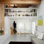
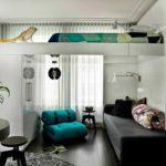
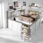
There are still non-standard options for installing a bed in the only living room. For example, if the ceilings allow, you can put the sleeping place under the ceiling. To do this, build a solid structure in the form of a closet or podium, and on the “roof” make a bed.
- Shelves disguise the sleeping place at the top
- For those who are not afraid of heights
- Transfer the sleeping place on a kind of podium
There is another option with the same podium. On it to make a working or living area, and under the planking hide a pull-out bed. It is difficult to think of a more rational use of space.
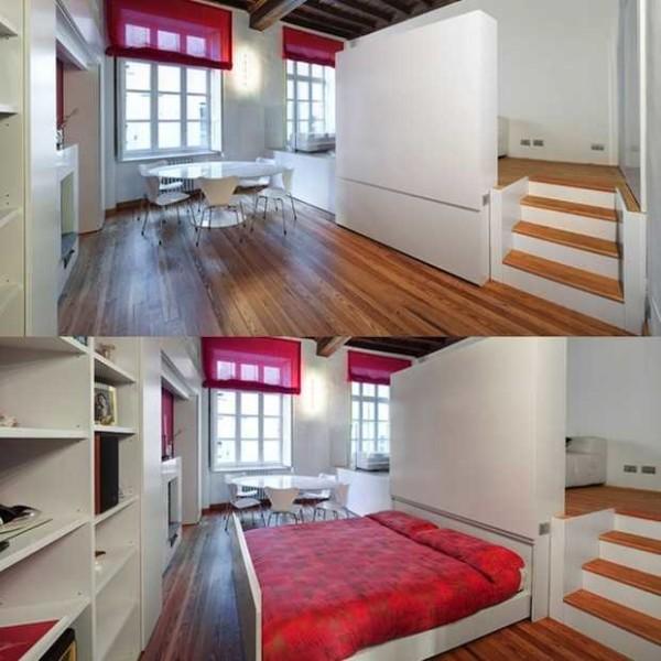
You can still play with the design of the bed. They can drop from under the ceiling, be disguised as a closet. Such beds are already on sale and are called “bed-cabinet”.
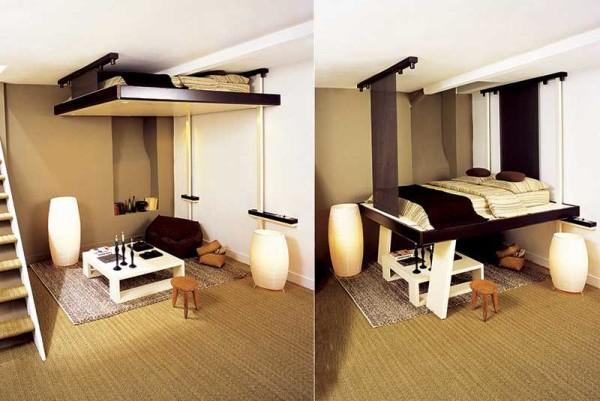
In general, there are enough solutions. The interior of a small room in a one-room apartment can be both beautiful and functional.
Small bedroom
Even if you do not have a studio apartment, a small bedroom is far from rare. Many of its area does not exceed 10 square meters. In this case, from the furnishings leave only the necessary items. In the obligatory order of the bed, bedside tables. Everything else – if not much overloaded interior of a small room.
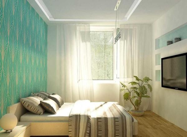
Without a closet in the bedroom is very inconvenient, but a massive object takes too much space. It can be replaced by a closet or closet. In fact, they differ in size and filling. Dressing room in depth should be at least 1.2 meters (so that you can go in). In long and narrow bedrooms with the entrance door on the short side, you can fence off a place right at the entrance. This makes the room more regular in shape – closer to a square, and such rooms are perceived as more spacious.
If the entrance to the bedroom is on a long wall, you can use one of the corners or the end wall for a dressing room. Everything depends on the specific layout. If there is the slightest possibility, allocate such a place. You will be amazed at how many things with the right organization there can fit.
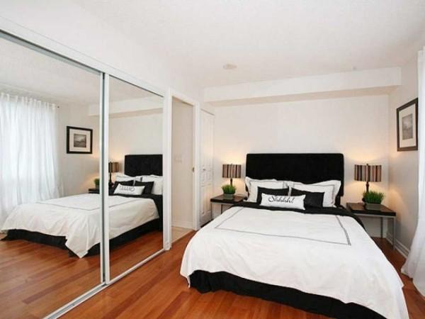
One of the more traditional options – the wall opposite the bed to take furniture. But it will have to be made to order – the whole wall. So the bedroom will have a modern look. The style of design of this “wall” you choose based on the general style.
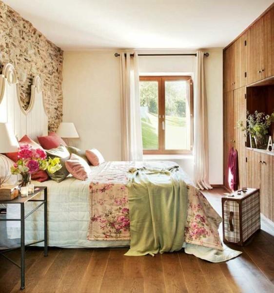
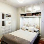
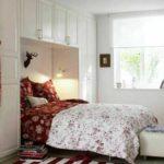
Another idea for organizing a small bedroom is to build the headboard of the bed into a furniture wall. From the point of view of feng shui it is wrong, but from the point of view of rationality – a great option.
- The upper part of the wall is occupied by cupboards
- A workplace is organized at the same time
- White furniture is lost against the background of the same wall.
It is difficult to think of something else in such a narrow-specialized room. The main task is to correctly put the bed and choose the right color design.
Quarto das crianças
In the concept of “children’s room” is quite stretchy. This is a room for preschool and school-age children, up to teenagers. As you realize, the design and filling in this case is significantly different, but the ideas are similar.
The main way to save space is to make a bunk bed. In this case, the sleeping place can be one – upstairs, and on the “first floor” is equipped with a workplace. This is the option that will suit both babies and older children. The sizes of beds are also not very different: too fast children grow up, so mostly buy teenage beds at once, adding a “childish” entourage with bedspreads, pictures and other accessories.
If you are afraid of height, you can make another type of bed – with a retractable second bed. Also not a bad option.
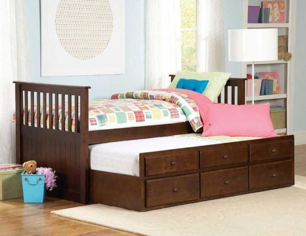
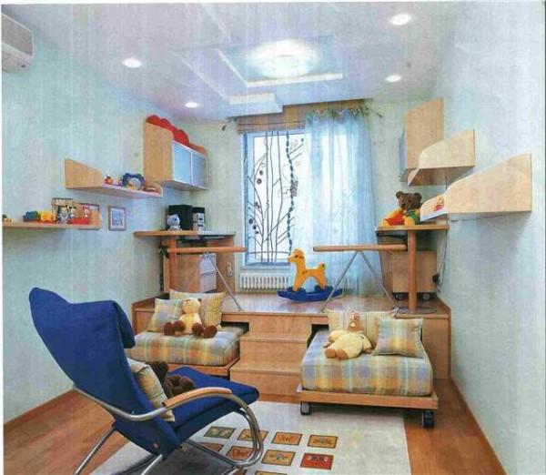
If the second sleeping place you do not need, under the bed you can make drawers for toys or things. In the interior of a small room, everything is subordinate to the task of optimally using all available space, while freeing up maximum free space.
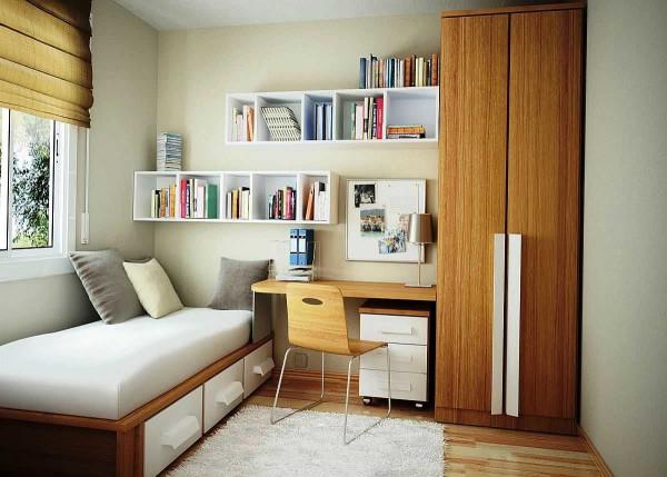
For grown-up children use almost the same techniques, only in a different design.
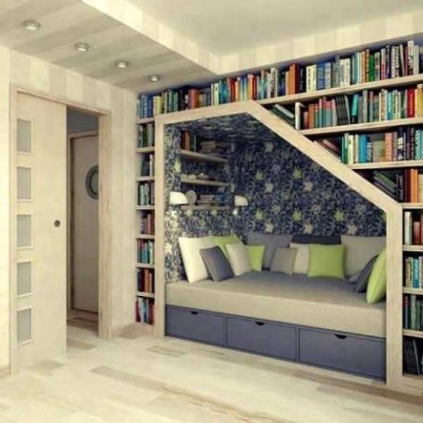
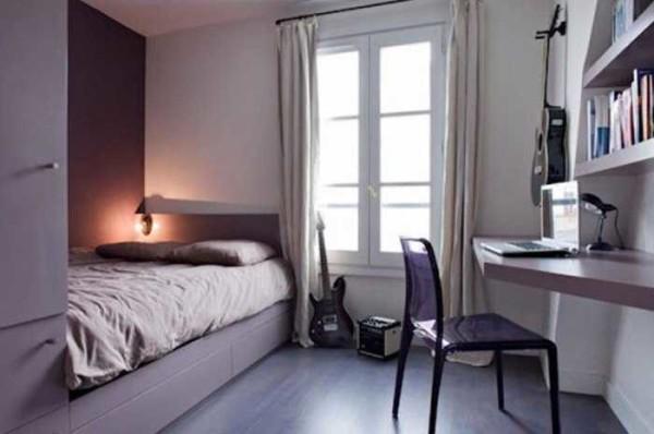
When designing the interior of a small children’s room, use the above rules: three colors, multi-level surfaces, the absence of unnecessary details.
General principles of design of children’s rooms are described in this article.
Living room of a small area
No matter how much you want to stick wallpaper with a large pattern in a small living room, you should not do it. Unless in fragments or on one wall, using the principles of combining wallpaper of two types, otherwise they will “eat” the space and there will be a “box” effect. You will almost physically feel how the walls are pressing on you. The best choice – solid-colored walls of pastel colors.
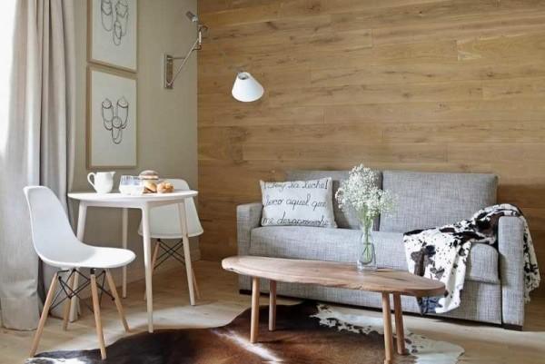
Here the texture can be different. It can be decorative textured plaster, wallpaper with a beaten pattern or fiberglass canvas with a texture for painting. It is very fashionable to decorate one of the walls with wood or stone (stone tiles or flagstone). All these are ways to diversify not too large set of furniture, which is usually present in a small living room. Most often it is a sofa, two armchairs, a coffee table and a TV. It seems, not a very large set, but there are many variations. First, there are furniture of different shapes, styles and colors. And the number of combinations is very large. Some of them in the photo gallery.
The design of living rooms is considered in detail here, and you can also read about the choice of wallpaper for the living room and about the features and types of curtains for this room.

