

The influence of colors on a person is a scientifically proven fact. In order to live a comfortable life, it is necessary to choose the right combination of colors in the interior. It is not so simple. There are special rules that must be adhered to so that the colors were compatible. There are also ready-made tables that facilitate the whole process.
記事の内容
Principles and types of formation of combined colors
In nature, there is a huge number of shades of colors. But, as you probably noticed, not all of them next to each other look equally good. Some, it would seem, unexpected combinations simply mesmerize, from others rather want to look away. All because when selecting colors for the interior, flowerbeds, bouquets, clothes should be guided by certain rules and principles.
To make them easier to remember, created special tools – the color wheel and tables of matching colors. In principle, the main tool is a circle, and tables – this is the finished result of selection on it. If you want to master the basics of color combination, use the circle. Otherwise, pick up a variant from the tables.
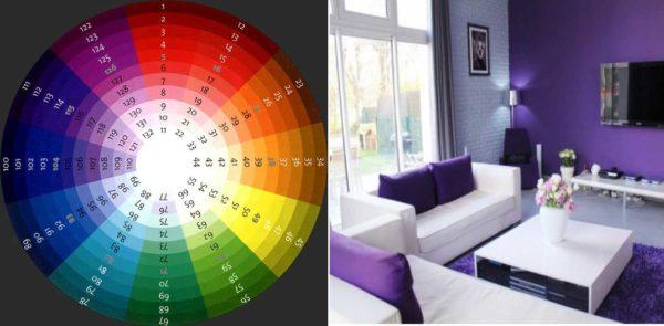
Color wheel and rules of its use
The color wheel consists of three levels. Inside contains the basic colors – red, blue, yellow. They are called primary. Their pairwise combination gives three additional (secondary) colors – violet, orange, green. On the third level tertiary colors are placed – it is a result of combination of secondary and primary. On the basis of these colors and select the combination of colors in the interior (and not only).
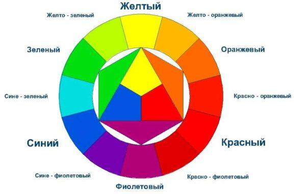
As you can see, black, gray and white are not represented in the circle. They do not exist in pure form in nature, in interior design can be used as basic (white and gray) or additional.
Number of colors
Before explaining the rules of using the color wheel, you need to understand the number of colors for their harmonious combination. In general, you can use two, three or four combined shades. To them you can still add universal – white, gray, black. This is exactly what decorators and artists do.
But for an interior two shades – it is too monotonous and boring. Much more interesting rooms decorated with a combination of three, four or more colors. In this case, it is wrong to use colors in equal proportions. One or two of them are chosen as the main ones, they are “many”. In these colors are painted walls, floor, they are present in the upholstery of furniture, textiles. Another one or two are used as additional colors. They are not so many, but they are noticeable. The rest – no matter how many of them there are – serve to bring variety and accents. They are present in small quantities – they are details of decor, pillows, etc. If you look closely at the interiors that you like, most likely, you will find this pattern of distribution of colors.
Combination of colors in the interior on the basis of the color wheel
Using the color wheel, you can use it to choose the combined colors. Do it according to certain rules. There are several principles of forming combinations:
Only according to these principles, you can form several dozen combinations. But there are also extremely distant pairs and combined four colors. This still adds to the number of options.
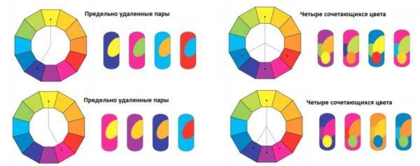
But this is not all. Each of the colors in the circle changes in saturation – from lighter in the middle, to darker outside. That is, in the selected sector, you can pick up several shades in tone. Such a combination of colors in the interior is called monochrome. They are also used in design.
To play with color is sometimes interesting. And to not be too boring, as accents can be used “universal” – black, white, gray or red – to taste, depending on the desired mood and purpose of the room.
Tables of color combinations in the interior
Sam pick up the combination of colors in the interior, maybe, and interesting, but in ignorance you can make mistakes. For simplicity created tables that simplify the creation of the interior. Especially if you know how to use them.
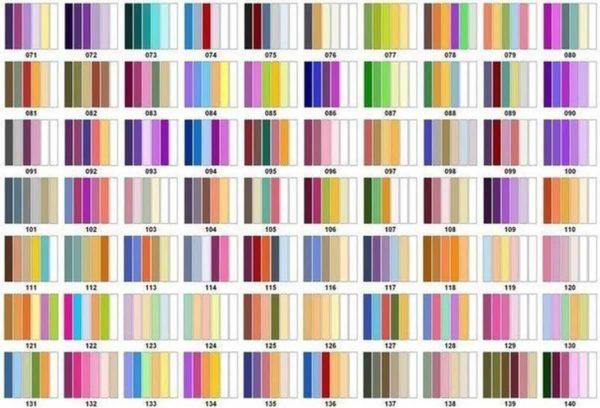
In color tables, the combination of colors in the interior is given in the number of five or six shades. Use them to remember the rule. The first shade is the main color, the second and third – additional, the rest – accent. This is how you distribute the colors.
In such tables, look for the first position of the shade that you want to make predominant. Trying, you can find from three or more options. After all, there are tables that are made according to contrast, complimentary, etc. principles. So there are quite a few variants. For example, in the above piece of tables (actually there are lots and lots of such sheets), there are two combinations for bright blue: 127 и 135. There will be even more on other sheets. From the found options choose that combination of colors in the interior, which you are more imposing.

There are tables that have a different view: they have a dominant shade is located perpendicular to the additional and accent colors. The rules for using the tables of matching colors from this does not change. Only the main color is highlighted, thanks to which it is a little easier to navigate.
Photo examples of interiors with the indication of the used color combination
About the fact that colors affect mood and well-being have long been said. There is even such a direction of alternative medicine as color therapy, where different kinds of disorders are treated by being in the interior with the predominance of a certain shade. So the “mood” of each color is worth keeping in mind when choosing a palette.

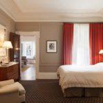
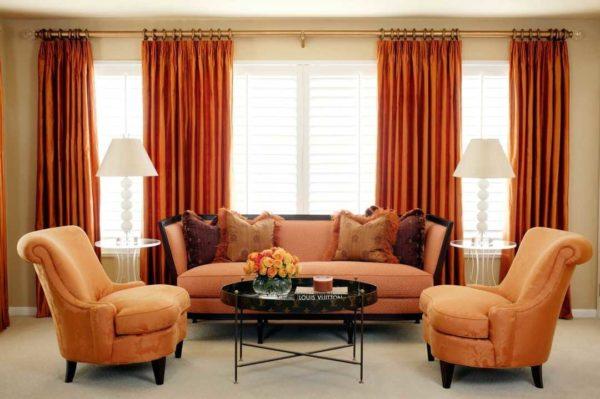
Red: combined colors
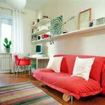
Red is a very active and aggressive color. Usually it is present in interiors as accents – to break the monotony of design in white, gray or beige tones. In this case, it is almost indispensable – very well revitalizes the picture. You can see for yourself – below are a few photos. Red in the interior of the living room only in this variant and can be, otherwise the inhabitants have increased anxiety, may even begin to have health problems.
-

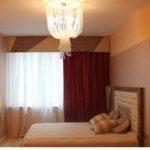
- In the interior of the bedroom red color can be part of the textile, a few decorative details
-
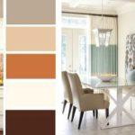
- The main in this interior is milky white, additional – brown and beige, accents – green and red.
-
- Approximately the same gamma, but for a living room in a different style – here instead of green black details, which gives more “coldness” to the atmosphere.

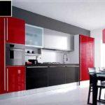
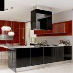
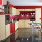
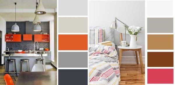
A place where red can be the dominant color – the kitchen. Here you need high activity and this color will give you vigor. And, at the same time, it will also increase your appetite.
-
- Even in the kitchen, red is present as an accompanying color, but not the main one
-
- In modern kitchen sets, the fronts can be of different colors
-
- If you add beige, you get a softer interior
-
- With beige color red does not look so provocative
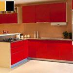
If you need such an effect – please choose a combination of red as the main color. As an additional with it comes gray, shades of white, beige, can meet black details. You can still meet a little green – in the form of plants or a few details. Other colors are rarely woven in, otherwise it turns out too motley even for the kitchen.
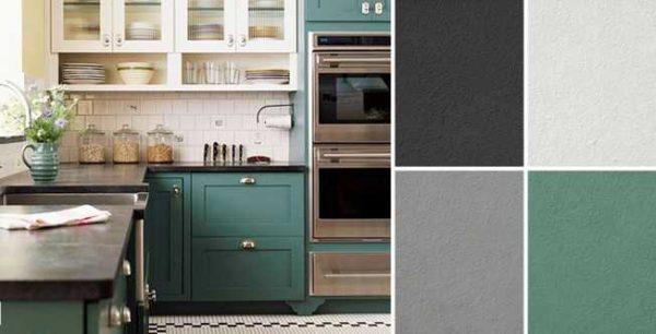
Combination with gray
Gray – dim, the so-called base color, with which any other colors are combined. For interiors of living rooms, this is one of the best options. There are several ways to form the right combination of colors in the interior with the prevailing gray. Take two or three shades from the gray range, add one or two shades of another color and you get a very harmonious design.
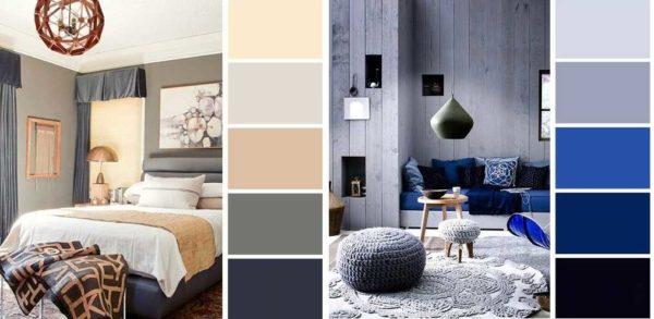
In the photo above, the interior of the bedroom is formed according to this principle. Light gray in them – the main, two more saturated shades – additional. As accents are used in one case blue (complimentary shades), in the other – pastel pink.
By the way, with gray looks good and brown, and if you add to them as an accent raspberry, yellow, orange – warm shades – you get a very cozy and “warm” interior, which is suitable for a bedroom, a girl’s room, applicable to the design of the kitchen.
Gray in the kitchen also looks very good. It is suitable for creating interiors in the style of loft, high-tech, modern. In this room, everything can be even simpler: to three or four shades of gray add one bright – yellow, red, orange, blue, green. In one of the bright and warm shades. It turns out a very unusual and not at all dull combination.
In general, interiors in gray – with any accents – turn out a little cold. For the kitchen it is not bad, especially if it faces south. Such combinations are not bad in the corridor/hallway. In those interiors where there are at least two warm shades with gray, and the interior turns out warmer, quite suitable for bedrooms, living rooms.
Beige and colors combined with it
Beige in the interior is even more universal color. Like all, it has warm and cold shades, but in any case it creates an atmosphere of coziness and reliability. You can create a monochromatic interior on the basis of beige colors. This option for lovers of restrained interiors. Such a combination of colors in the interior is characteristic of the classics.
If you need solidity, add brown, for greater lightness any color spots are suitable – as in the case of gray. To cold shades of beige add cold shades of color spots, to warm – warm.
-
- In the bedroom, beige with brown creates a sense of stability
-
- For accents, add one or two bright or pastel color patches – depending on the effect you want to create
-
- Several color combinations based on beige shades with the addition of colored accents

-
- Characteristic ranges for calm neutral interiors
Beige can be chosen as the main one. In him then paint the walls and floor – in lighter shades. Furniture is chosen darker, but also beige or brown. Add a few accents of bright colors. That’s it, a harmonious interior is ready.
Match the colors to the furniture
Often when selecting colors for the interior are tied to the existing furniture. For such cases, too, there is a table of matching shades. It is not difficult to work with it: in the right column choose the color of the furniture, in the middle column prescribed friendly colors, in the far left those that are incompatible.
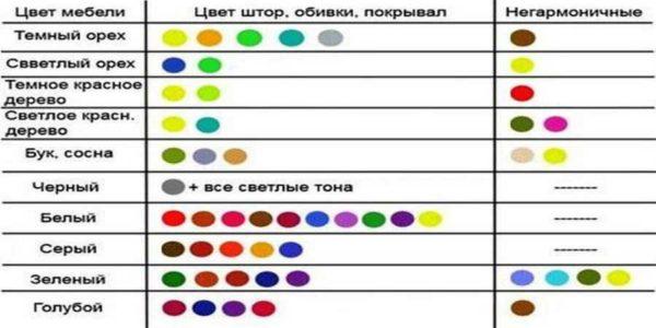
But you should not use all possible colors. In addition to the color of the furniture can be present three to five more colors. At the same time, the basic ones – white, gray, black – also count. So do not overdo it.


I once painted my living room in teal and mustard, and it totally transformed the vibe! It’s all about finding those unexpected combos that pop. Trust me, a fresh color scheme can breathe new life into any space. Don’t sleep on color – give it a shot!