
Decorating a room is not an easy task. It is necessary to take into account a lot of information about how to select colors, how to combine them and in what quantity, where they should be used, where not. In this article we will talk about how to apply the color fuchsia in the interior.
Artikkelin sisältö
What is the color fuchsia and how it is used in the interior
One of the shades of bright pink is called the color fuchsia. Saturated pink with a slight purple tint. Approximately this is what its verbal description looks like, but the color is best to look at the photo.
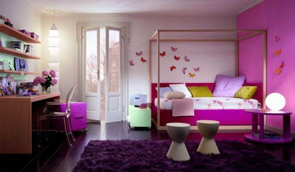
This color is very bright, saturated, cheerful. Even its light shades “warm” the interior. Therefore, most often the color fuchsia in the interior is found as a companion color or one of the additional, but very rarely it is used as the main one. It is too bright and “active”. Psychologists describe it as the color of active communication, the color of activity and recommend using it in limited quantities. It can be used when decorating a bedroom, living room, kitchen, bathroom, nursery, hallway. But no matter how many photos you look at, you will not see the color fuchsia in the interior of the office. It is incompatible with a serious and business environment. And this should be taken into account when developing your own design.
Design techniques
There are certain design techniques that allow you to use all the advantages of this bright color. As a companion color, you can apply such techniques:
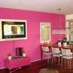
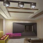
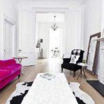
- In an interior with neutral walls, one of the walls to make an accent – paint in the color fuchsia. The same color in small quantities is present in small details of the interior. To make everything look harmonious, it is better to make the floor dark. There are also requirements for furniture: it is better if it will be simple shapes, without pretentiousness.
-

- The interior is only a frame that emphasizes the advantages of fuchsia
-
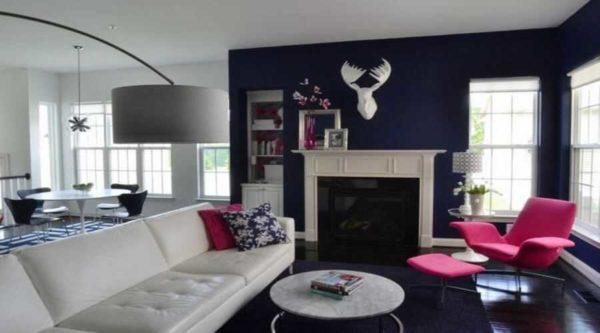
- Color fuchsia in the interior is used dosed
-
- Accent wall color fuchsia in a “calm” interior – a common way to revive caritnka
-
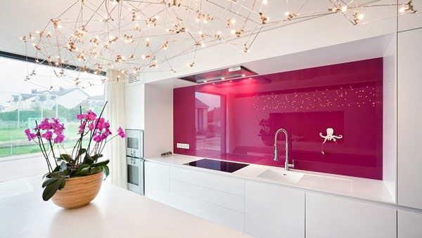
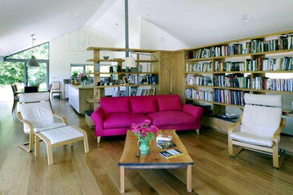
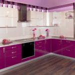
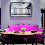
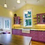
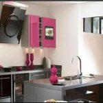
- In a neutral interior design, make furniture with facades and / or upholstery fuchsia color. This technique is popular when decorating the kitchen. With the overall neutral design bright furniture looks very good. Not bad this approach and in the design of the living room or bedroom. It turns out very interesting interiors. On the one hand boring and bright, on the other – not too overloaded with color.
-
- Bright facade of kitchen furniture – a great way to make the kitchen interior lively and warm
-
- In combination with a small amount of green and brown fuchsia looks even more favorable
-
- Background neutral tones serve as a background for bright and saturated color fuchsia
-
- All the same combinations – for a feeling of stability and comfort.
-
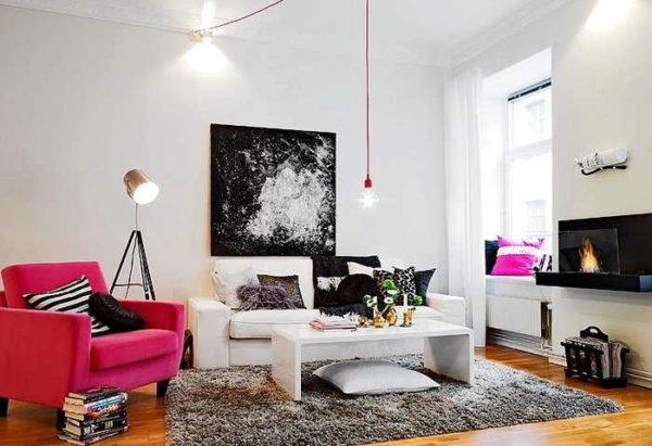
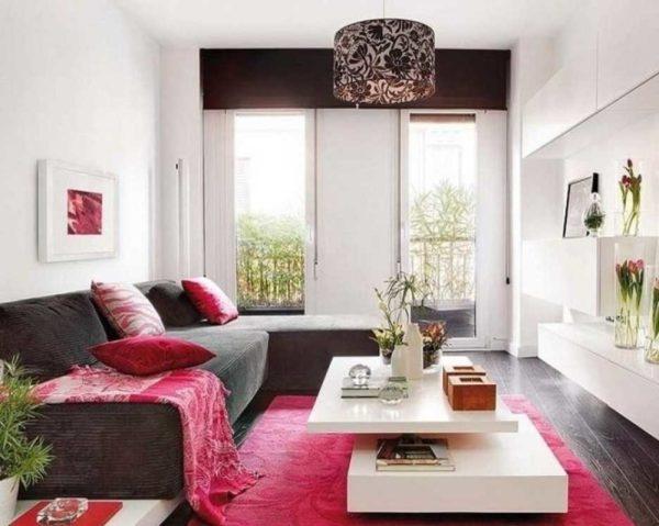
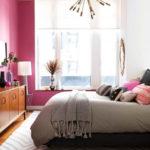
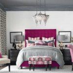
- Refresh the design in calm tones with fuchsia-colored textiles. A very good approach if you are not sure that you will be comfortable with this combination of colors. Buy and hang curtains in fuchsia color, the same bedspread, sew pillowcases on sofa cushions… All this is easy to do and not very expensive. It is also easy to then replace with textiles of another color. If, suddenly, it turns out that you are bored with it. And by the way, do not try to find curtains with wide vertical stripes of fuchsia color. They are certainly stylish, but very quickly get bored and begin to irritate.
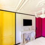
- Dilute the “fuchsia” with a bright yellow color in the same amount. Strange as it may seem, but two bright shades neutralize each other. Although, the interior turns out strongly “on the amateur”.
-
- Strange as it may seem, it looks good with bright yellow color
-
- Not so bright shades, but the mood is preserved.
-
- Yellow and fuchsia are very little, but they attract the eye.
-
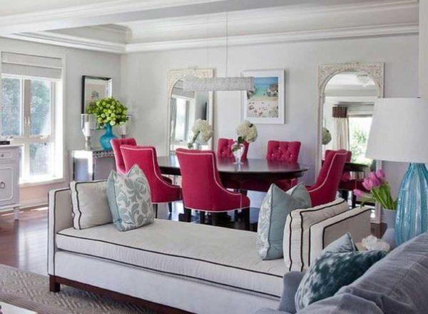
Even more options for those cases when the color fuchsia in the interior is used as an additional. It can be in combination with other bright colors, but there are also interiors where the rest of the additional colors of the neutral range. It all depends on the style in which the interior is developed and the desires of the owners. In general, this color is considered “girlish” and feminine. Few men will agree to live in such an interior. If you develop the design of a common room – living room, marital bedroom – it is better to first test whether the stronger half of your family can get along with such a color. The trick with textiles is very good for this. If there are no objections. And everyone will be comfortable, you can paint the walls or look for wallpaper.
What bright colors it goes with
Fuchsia is one of the colors that occur in nature, therefore it is “natural” colors and shades that are combined with it. One of the best combinations is with green. But both colors are bright, so they can be very little in the interior. The main thing in such a case is not to overdo it. As “green” can even be a plant, not just some accessories or interior details.
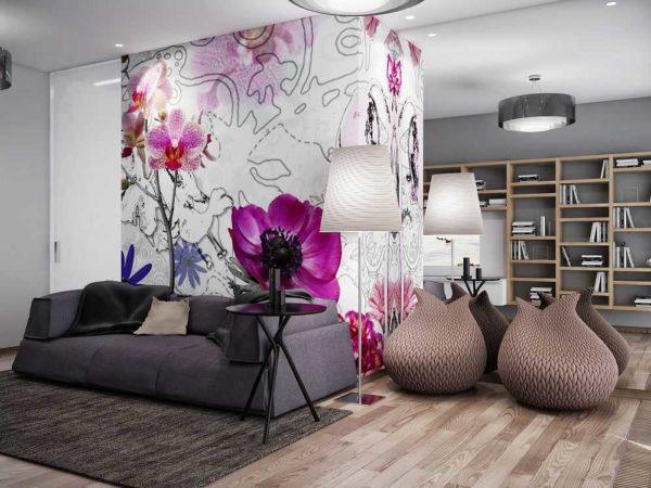
If you look at the fuchsia flower, which gave the name to the color, the most popular combination is just that unique shade of pink with lilac or purple. This combination of colors is also used in interior design. And, as usual with bright colors, everything should be strictly dosed. Otherwise, it will be impossible to relax.
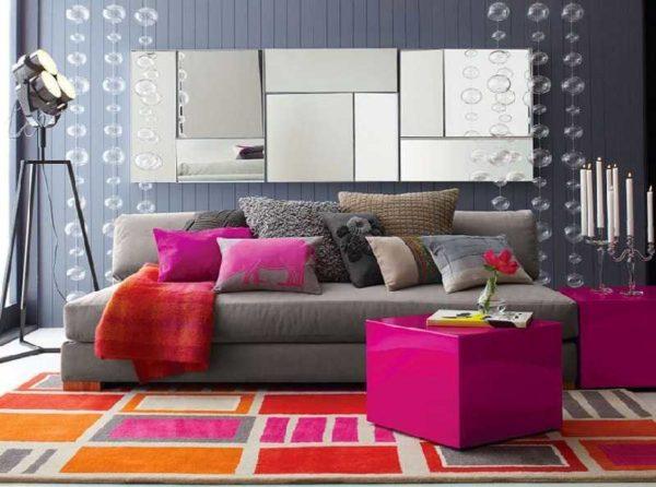
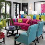
If we continue to talk about compatibility with bright colors, then you can not pass by the combination of fuchsia and bright blue. Very spectacular, vivid and… quite aggressive. So this combination is also used in small quantities.
-
- With this combination, the rest of the interior should be very calm
-
- The combination of three bright colors – it is possible, but on a completely neutral background, with plenty of air and light.
If we talk about other bright colors, then sometimes add orange, mustard. They are added only as accents – in very small quantities. Only a few rooms – like girls’ rooms for active and bright – can withstand such combinations.
Allow one more piece of advice. If besides the color fuchsia in the interior use at least one more bright, it is better to make the walls monochrome. They can be painted with water emulsion, apply a solid-colored decorative plaster. Another option is to paste glass wallpaper and then paint. This is if smooth surfaces do not entice you, and plaster seems too “officious”. These are the techniques you see in the photo. No motley. In extreme cases, you can use wallpaper with a vaguely pronounced pattern like monochrome silkscreen.
Calmer combinations
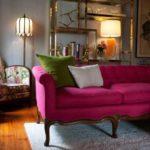
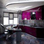
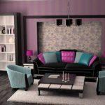
For fans of calmer combinations, too, there are some very interesting options. Great looks fuchsia with gray and silver. The combination turns out to be “noble”, fits into many styles. Such a design is suitable for almost any room: for the bathroom, living room, bedroom, kitchen, hallway. Everywhere such a combination of colors creates an atmosphere of stability and coziness. Not too motley, but not boring.
If gray and silver in combination with fuchsia seems to you, after all, a little “fresh”, add a few details of black. It will add contrast, but will not make the interior motley. By the way, black can be “anthracite” and “wet asphalt”. All this has an impact on perception and mood as well as the type of surface. Matte, glossy, with a silky sheen – objects with different types of surface, but the same coloring look different. Keep this in mind.
-
- If you add a little black to gray and fuchsia, the design becomes more dynamic
-
- Gray and white as the main colors, fuchsia, black and brown as additional and accent colors.
-
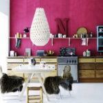
- In the kitchen, such a combination emphasizes the stylishness of the furniture
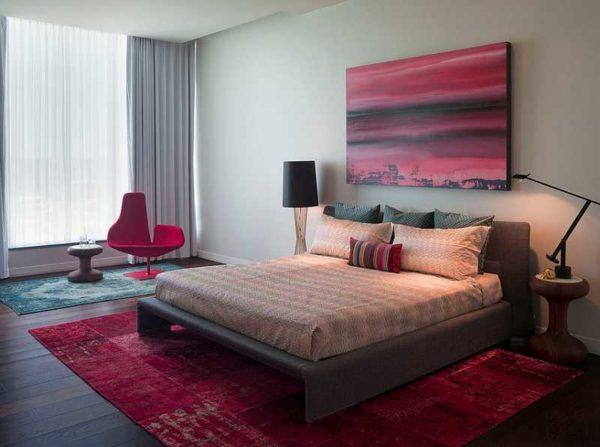
Another option of calm color combinations for fuchsia – with brown. But light shades are rarely combined.More often you can see in the company with fuchsia chocolate or very dark shade. Background (main) color in this case is chosen one of the warm shades of white (milk, melted milk, ivory, etc.) or some light beige. The general feeling of such an interior is warmth, stability, measuredness.
Tables of combinability for the color fuchsia
Harmonious interiors are obtained if competently combine colors. They are selected by the color wheel according to certain rules, but to make life easier there are ready-made tables in which these colors are already selected. So much easier than guessing or making combinations by the rules. It is only necessary to understand how to use these tables. In the photo below are some ready-made color combinations for the color fuchsia in interiors. On the left of the photo is a table, on the right – one of the variants of its embodiment in the interior.
In the presented tables, five colors are chosen each. The first is basic. It is a lot, it is the main one. The next two are additional. They are also a lot, but much less than the “base”. And the last two – accents. In these colors make color spots. They can be quite a bit.
As you can see, in most cases, the color fuchsia in the interior is used as an “accent”. And it is justified: it is too bright. When there is a lot of it, it is tiring. If you like some combination of colors, but are not satisfied with, say, the base color, you can either use a lighter shade of the same color, or choose as a “base” another, which is in this table. If none of them suit you as a base color, you can take white or light gray. Also within the same table, you can swap additional and accent colors, you can use lighter or darker shades.
Color fuchsia in the interior: photo