

Many people want to have a beautiful and cozy kitchen, and it is also desirable that it is uplifting and it was “warm”. One of the options is a kitchen in green colors. Natural color, which is a symbol of life and will definitely not leave indifferent. And how to make it so that it was beautiful and cozy, let’s understand.
Artikli sisu
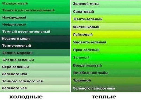
Green is what shade?
Green color has so many shades and tones. From saturated and dark malachite, then a gentle pistachio or light green. There is also a different approach to interior design, the choice of the “role” of green color – the main, additional or accent … All this allows you to get different mood interiors, although each of them can be called “green”.
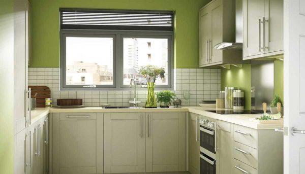
So that the kitchen in green colors corresponded to your expectations and you are not tired of it, decide what kind of atmosphere you want to create: calm, relaxing, invigorating, joyful, warming. The choice of shades depends on this. For a calm atmosphere, soft tones from the “cold” part of the palette are suitable. They can be used as the main ones – for walls, facades. For a warm, warming effect, you can choose one of the shades of the “warm” part. But here you need to look that it was a little: this color can be a kitchen apron, some part of the facades, accessories and additions to the kitchen interior of restrained tones – just to bring notes of bright mood.
The list of shades of green color is given in the photo above. But remember that the photo and the screen distort the colors. To have an accurate idea, you need to look at the color “live”. You can do this in stores that sell paints, in which there are tinting stations. They have a list of colors. There distortions are usually minimal.
The role of green in the interior of the kitchen
If you look at the interiors of the kitchen in green tones, you can notice that not only the shades differ, but also the amount of this color. And this is also the point with which you need to decide. If you have already had experience, and you were comfortable in green, you can immediately order furniture and look for a shade for wall decoration. If, however, you only want to “try”, it is better to start with some details.
As the main
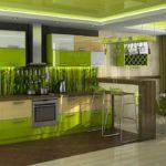
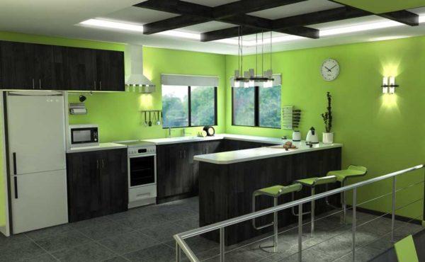
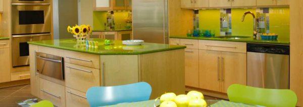
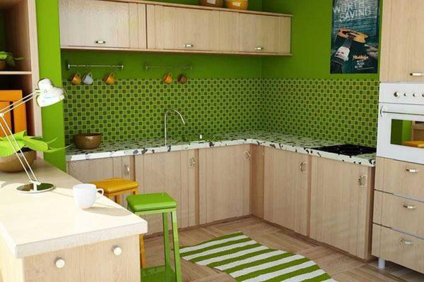
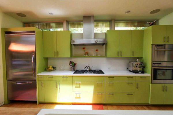
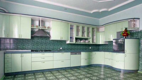
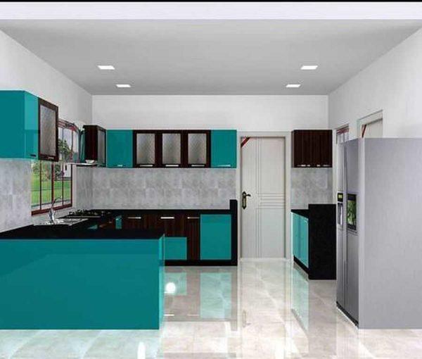
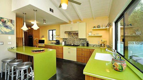
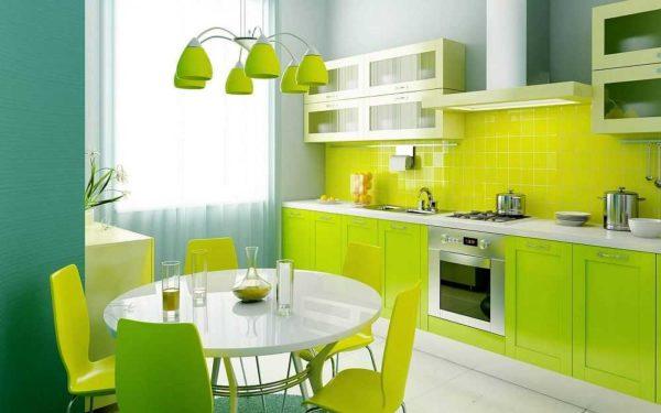
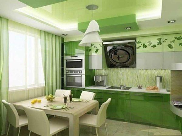
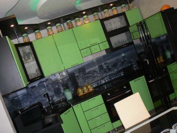
The kitchen in green is far from always a monochromatic design. Green can be the main color, and then there is a lot of it. He can be accent or additional. Then it is present only in some details. For example, if the walls and furniture fronts are painted in green of different shades – this is the main color (several variants in the photo).
-

- When green in the kitchen is the main color
-
- The main thing is that the color does not strain….
-
- In such a palette will be calm and cozy
With this approach, there are several important points. First of all, in this case, you choose dim, calm shades. Although the kitchen is a zone of active activity, many people use it also as a dining room, and in this case it is better to find something quieter.
Secondly, in such interiors, additional colors (floor, ceiling, countertop) – neutral, and, only accents (some accessories), can be bright (but combined). With greens are perfectly combined with red, blue, in some variants – yellow or orange. Brown or black should not be forgotten either. Some details of similar, bright, colors are needed to dilute the green. Strange as it may seem, this is how it works – bright details draw a significant part of attention to themselves.
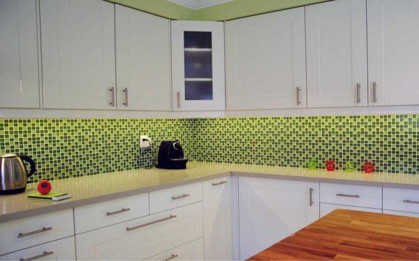
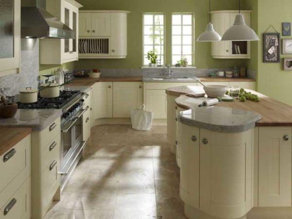
Only the front or part of it
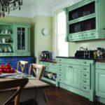
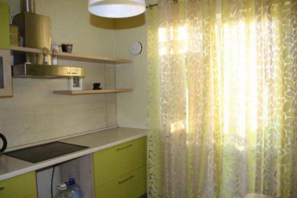
Green can be only the furniture facade or even just a part of it – lower or upper cabinets, or only part of the trim. There are no restrictions in the choice of shade – if you want, you can even lime or “toad in love”. But these are the tones that in large quantities quickly get bored. Optimal in this variant are pistachio, mint, green moss, green tea, apple. Interestingly looks furniture in dark green: malachite, emerald, jade, blue-green. But the rooms for such shades should be spacious and light, and the rest of the interior should be light and balanced.
Another option is to make green only part of the facade. Modern kitchen sets can be with facades of different colors: upper and lower cabinets can differ in color and texture. Also part of the drawers can be a different color. So as an option – make part of the fronts in green colors, and as the main use neutral – white, gray, beige and all their shades. This is an option for those who are not sure that the green will not “strain”.
As a complementary or accent color
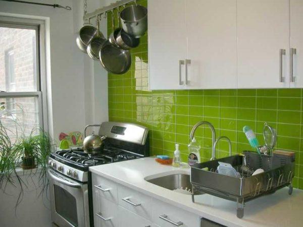
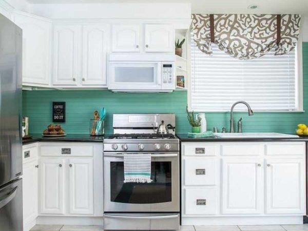
There is still a way to make sure whether you like the kitchen in green colors – to make such only easily replaceable interior details. To such can include walls under painting or wallpaper, countertops, some variants of the kitchen apron (plastic, glass, MDF).
For example, green walls in the kitchen will allow you to test the intended shade of furniture. To repaint the walls or re-glue the wallpaper is much faster and cheaper than ordering new facades.
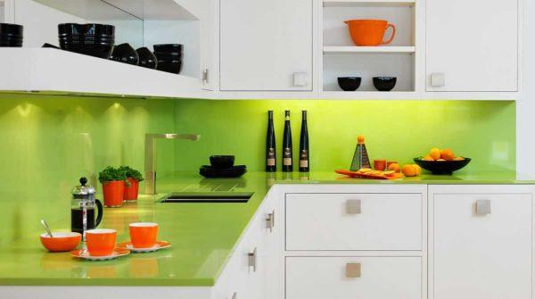
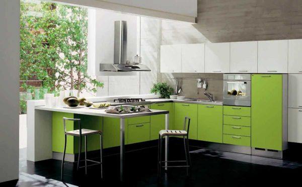
Despite the fact that the facades in the photo above are white, the interior itself is not boring – bright tabletop and apron attract attention. For a harmonious interior it is worth adding a few details of the same shade in another part of the room – in the area of the table.
Two different combined shades in one interior – this is also a very interesting idea, which can be played with different ways. The ideal way is mosaic. It can combine and more colors, but the most important thing is not to “overdo”.
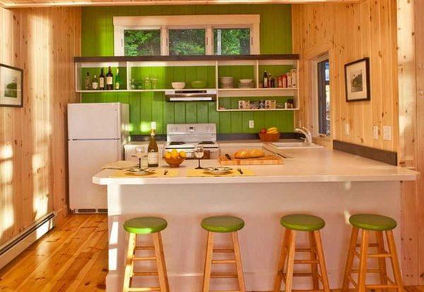
People living in wooden houses often suffer from monotony – “wooden” color everywhere and all the time also tires. A great way to bring a bright note – paint the working wall with green paint and add accessories of the same shade. They will perfectly “dilute” the yellowness of the wood.
For those who are wary even of such volumes of green, you can offer to hang curtains, some kitchen utensils that remain in plain sight, a couple of accessories (a clock, a picture, etc.). If the feeling is comfortable, it will be possible to expand the “captured territory”.
The most popular combinations
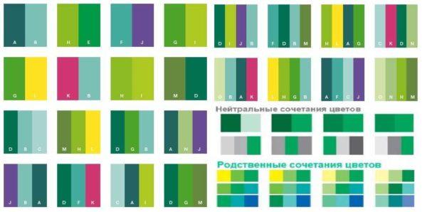
Harmonious color combinations in the interior is a complex topic. There are different ways to select the right shades – with the help of the color wheel, but the easiest solution is to use ready-made tables (in the photo below) or pick up exactly the same shades as in some of the photos. You can repeat the specific design only if you really like it, but it is desirable to practically “copy” the shades.
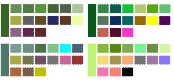
Working with color tables is simple. You choose the shade that will be your main color. It is usually represented as a larger than all the other stripes on the right or left. From the adjacent smaller rectangles choose those colors that you want to combine in your interior. But remember that all of them are divided into three parts:
- Main – one, sometimes two colors that fill a lot of space. If we talk about the kitchen, it is the walls and the kitchen unit. There can be three options: only walls, only furniture, and walls + furniture.
- Optional. One or two more shades, which are a sufficient number. In the kitchen, this is the floor, curtains, dining table, chairs, walls, kitchen apron, etc.
- Accent colors. These are the colors of accessories. This sometimes includes chairs, but mostly it’s small details – pictures, clocks, cups/plates, etc.
But searching for tables by key (main) color is long and problematic. You can do it another way. Find any table, in which there is a shade you like. It is considered the main one, and the rest we select from the line. The colors here are 100% combined, so everything will be harmonious.
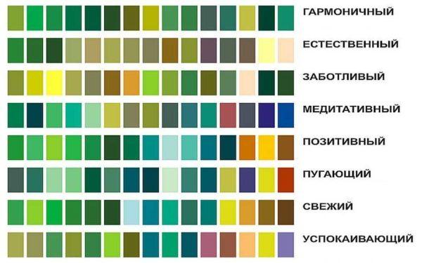
For example, you can use the table above. Find the desired shade and from the line pick up the accompanying colors and tones. Everything is extremely simple.
Although in the selection on the tables you can find unusual combinations, there are several traditional, proven in many interiors. Some of them are given below.
With brown
The combination of green and brown shades is imitated from nature. Just look at the trees around and you will see the perfect combinations. That’s why there are probably so many kitchens in green and brown colors. Usually neutral shades are added to this duo: white, gray, but there can be bright spots in the form of accessories.
Yellow cups, stools – the moment that adds color to a not too bright palette. In such an environment is cozy, calm and at the same time not boring even in the gray autumn-winter season.
Kitchen furniture is green with a white countertop, and the floor is a warm brown color. In general, the interior is perceived as green-brown. And the feelings are of confidence, dynamism and a certain restraint. They are strengthened by the presence of stainless steel, it also gives the style a modern orientation.
With white
White-green kitchen interior – a great option if you do not like shouting colors and combinations of bright, saturated colors. With white, even the brightest shade does not “load”, the feeling of lightness and light still remains, even if dark shades are used.
The classic combination of such a solution is green + white + gray. To them may (but not necessarily) be added in small quantities of black/brown/red/blue/purple/yellow/orange. These bright touches can dramatically change the “mood” of an interior. If you lack sunny color in winter or autumn, add bright spots – curtains, tablecloths, a couple of kitchen trifles of bright colors. Life will sparkle with new colors!
With gray
Green with gray is a basic combination of colors. It is suitable for those who prefer a calm, slightly cold atmosphere. The kitchen in gray-green tones can be decorated in the loft style, modern, classic.
Depending on the other colors can turn out quite cheerful, or cozy and calm.
Kitchen in green colors: photo examples
")


I recently painted my kitchen green, and I love it! It feels fresh and vibrant. I added some cool plants, which really pop against the walls. Plus, cooking in a green space just lifts my mood! Can’t wait to invite friends over to show it off!
Wow, I just painted my kitchen bright green, and it’s a vibe! Seriously, it feels so refreshing and alive. I added some funky decor, and now it’s my favorite hangout spot. Can’t wait to cook up a storm in there while enjoying the fresh feels!
Sounds awesome! Bright green is such a bold choice! I painted my living room blue once, and it totally changed the vibe. It’s amazing what a little color can do to lift your spirits. Enjoy making those tasty meals in your fresh, funky kitchen!
I just painted my kitchen green, and it’s totally vibing! The fresh look makes me feel like I’m cooking in a garden. I added some cute plants and funky decor, and now it’s my happy place! Green really brings everything together—can’t believe I waited so long to do it!