Black and white kitchen is a classic that does not lose popularity. Almost all modern design trends can be realized in this range: the design of Scandinavian, Dutch style kitchens, Provence and some others.
Makalenin içeriği
Features of the black and white gamut
Black and white interiors win-win: popularity over time do not lose – this is the main plus. The second plus – with the help of colored additions, it is easy to change the mood, and sometimes the style.
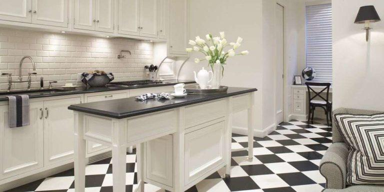
There are also disadvantages. First – when using quality (read – expensive) materials, everything looks “on five”. To save money will not work. The second – these colors do not best affect the psyche. Black provokes a bad mood, white is associated with medical institutions, sometimes contributes to increased anxiety.
In addition, their combination in pure form is too contrasting, which causes psychological discomfort. To reduce contrast use “diluted” colors, add details of “warm” color shades.
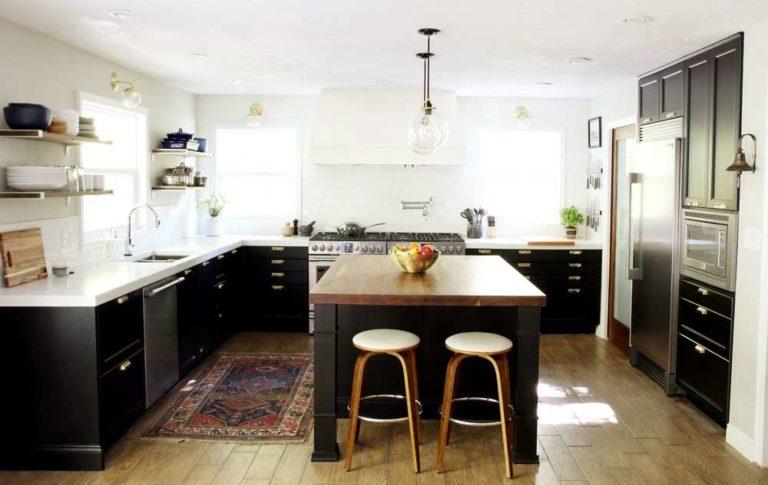
Let’s discuss the various techniques further. First, let’s talk about styles.
For what styles is suitable
Black and white gamma is suitable for almost all strict styles: high-tech, modern and other fashionable interior design trends. White and black solutions look interesting in the industrial direction and in loft design.
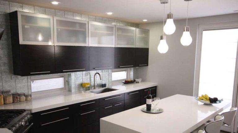
With all the differences, they are united by clear laconic forms, which emphasize the contrast. Furniture with a glossy or semi-glossy surface, shiny or metallized fittings are used.
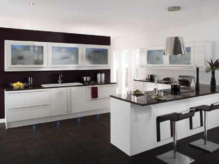
Furniture, decoration, additions are chosen geometrically strict forms (rectangle or square) and, as a rule, without a pattern. If there is an ornament, it is geometric compositions, lines or strokes that emphasize the simple geometry.
Glass inserts are matte or with mirror spraying, in a metallic or metallized frame. In more “soft” variants – glass is inserted in the doors without additional framing.
Use black and white combination in the styles of ethnic direction is more difficult, but possible. More often these are variations of the style of Provence or Scandinavian group.
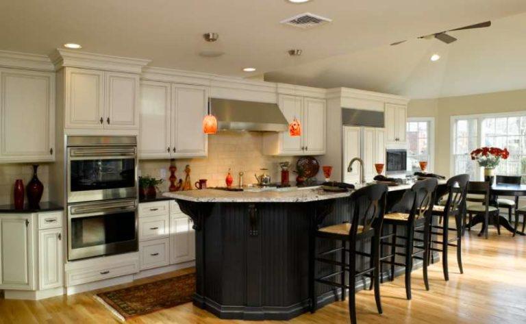
The difference of the ethnic group is that the furniture is matte, with finishing elements characteristic of these styles. In luxury kitchens, whitewashed wood is used. In the most expensive – solid wood, in the middle price range – furniture boards, in the economy class – veneer or film with imitation of wooden surface (MDF and CFD). Fittings of the same color as the facades or contrasting. Shiny in these directions is almost not used. Glass inserts in furniture fronts are more often transparent, rounded shape.
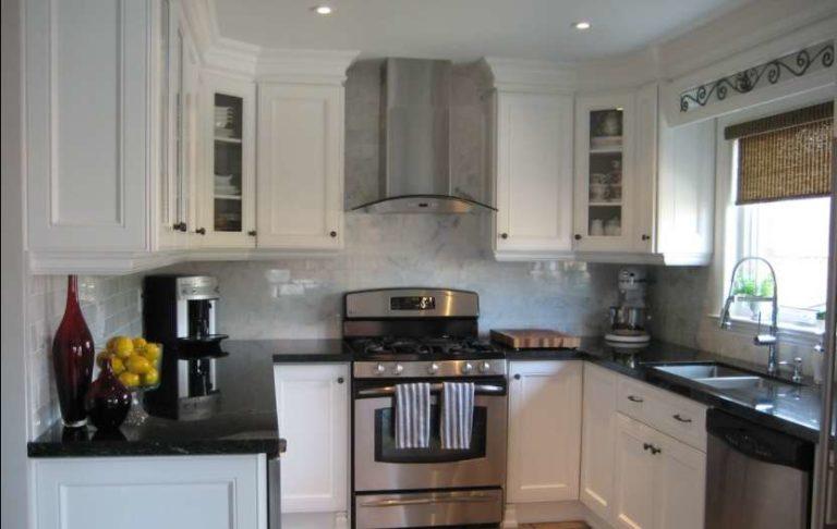
Since the styles are ethnic, they are usually softened by wooden flooring, colored additions, textiles.
How to distribute colors
Despite all the disadvantages, white (usually its shades) often prevails in interiors. Black is added little by little. In order not to feel “pressure” on the psyche, it can be no more than 30%. Even in a softened form. Otherwise, you want to escape from such a room, it is difficult to relax in it.
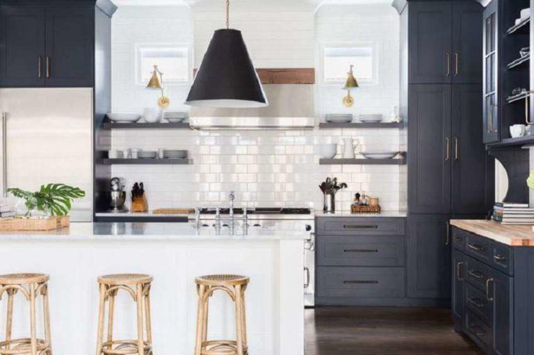
Next, let’s discuss the most popular options for kitchen design in black and white colors.
How to make a kitchen set
Let’s say right away: purely black furniture in the kitchen – an option not for everyone. If there is not much furniture, the kitchen is large and bright, with high ceilings – it is possible. This option is acceptable in a kitchen-living room or a kitchen combined with a dining room. In general, where it is spacious and light.
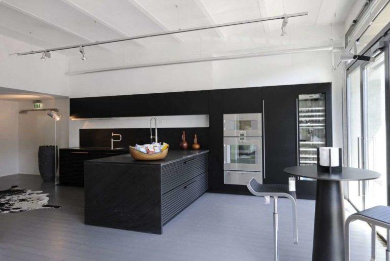
Even with these conditions, everything else (walls, floor, ceiling) is white or very light. In addition, you will have to develop multi-level lighting to disperse the gloomy impression.
To compensate for the “coldness” of the lamps, take lamps with a warm, yellowish spectrum of light.
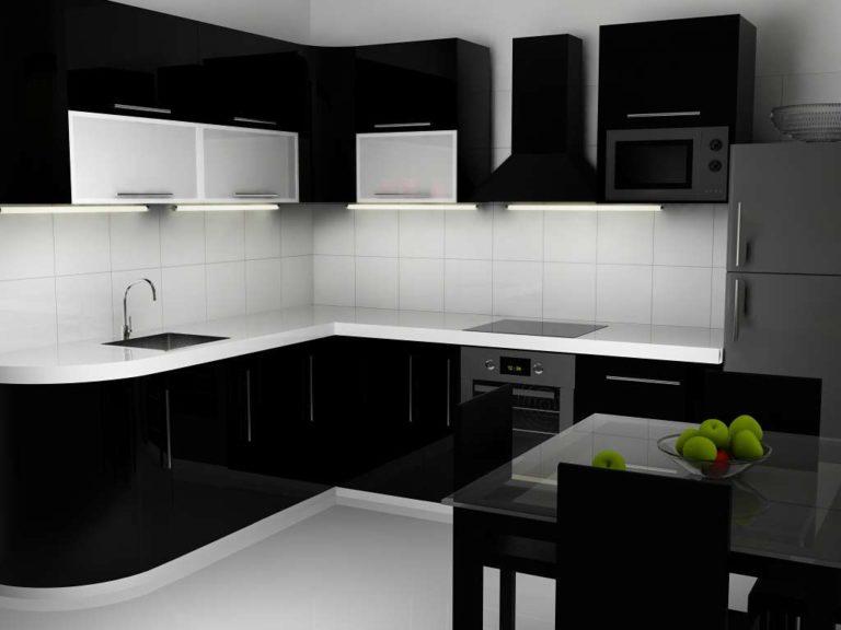
Much more popular (more pleasant in feeling) combined facades. This is when dark only the top or bottom of the kitchen set. And dark, more often make the bottom. This option allows you to visually “raise” the ceiling. It also looks good in small kitchens.
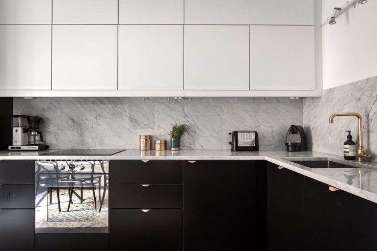
In the photo above is an interesting solution for the upper part – there are no handles. The doors open by pushing. Built-in spring-loaded openers are used.
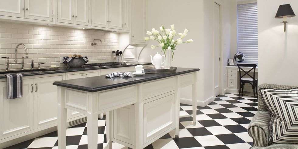
In kitchen sets of the island type, the design of the “island” repeats the “wall” part. This is a more traditional solution, but not the only one.
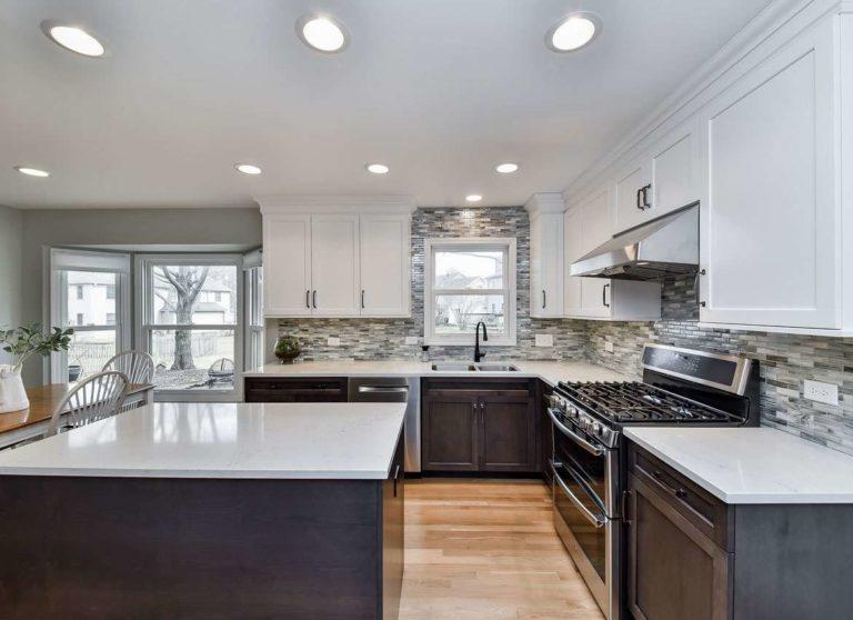
Sometimes the reverse option is used (as in the photo below). In this case, the “blackness” is added with the help of a table located in the center.
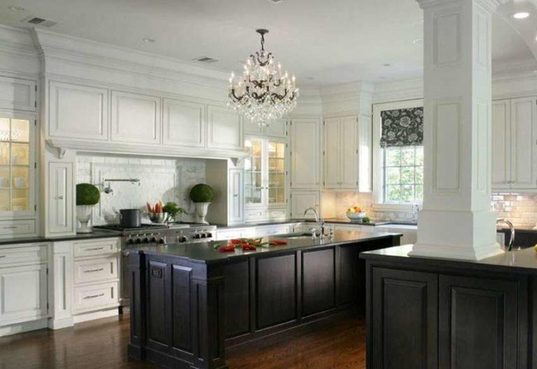
Note: despite the abundance of windows, the lighting is multilevel. This is characteristic of all interiors in this color scheme.
Walls and kitchen apron
It is still worth discussing the color of the walls and apron. With their help, you can change the feeling of the interior. If the furniture is not white, then white walls. And this is almost without options. The ceiling, by the way, too.
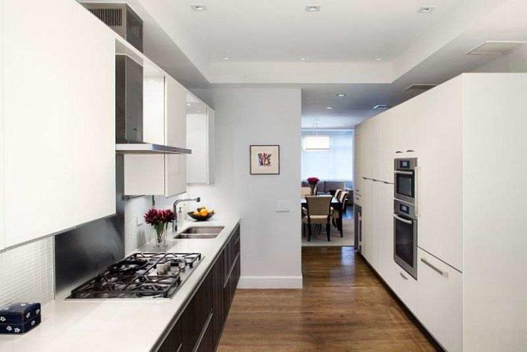
So that everything does not look too cold, in the paint add a little bit of color of a warm shade. There can be a slightly yellowish or pinkish color. If you add beige and pink, you will get the color of coffee with milk.
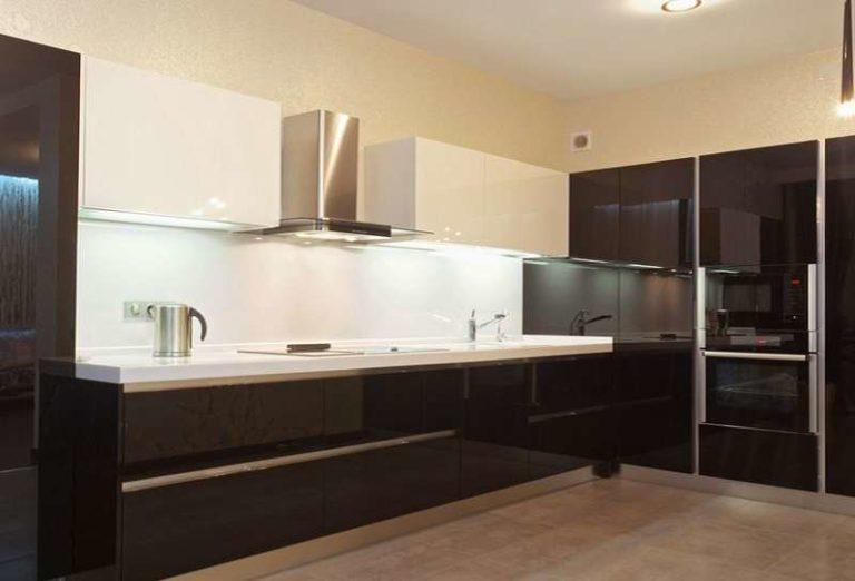
The kitchen apron is part of the wall, but this does not mean that they should be the same color. Usually it is the other way around. Most often, the color of the apron is chosen in tone with the countertop. If you look at the photos, it is this technique is used most often. It is very rare to see a black and white apron. He too attracts attention, shifting the accents.
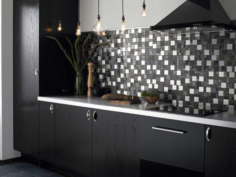
Variegation is useful if you need to draw the eye away from imperfections.
How to play up a white set
After thinking about it, we usually come to the fact that it is better to make the furniture light. Or, at least, its upper part. But not everyone likes black furniture, we do not want colored. And white walls, ceiling, furniture – it is boring and “cold”. Let’s discuss techniques that dispel boredom and “hospital” impression.
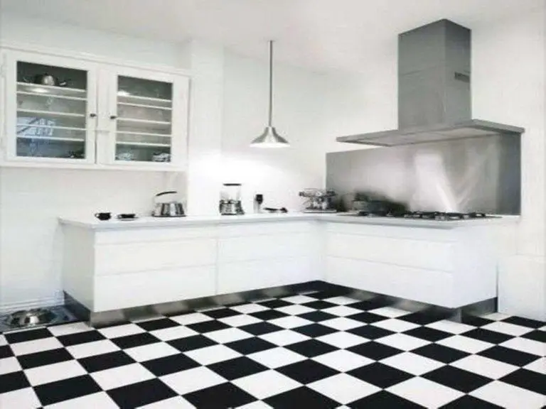
Dark wall
White furniture will not be massive even in a small kitchen. This is the truth. But the abundance of white resembles a hospital, does not give coziness. You can dispel this impression if you make one wall or apron dark.
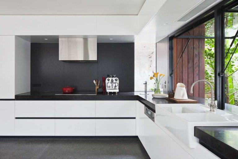
If the furniture is glossy, it is better if the walls and apron will be matte. Overkill with glitter, glare negatively affects the mood. The worst – you can not relax.
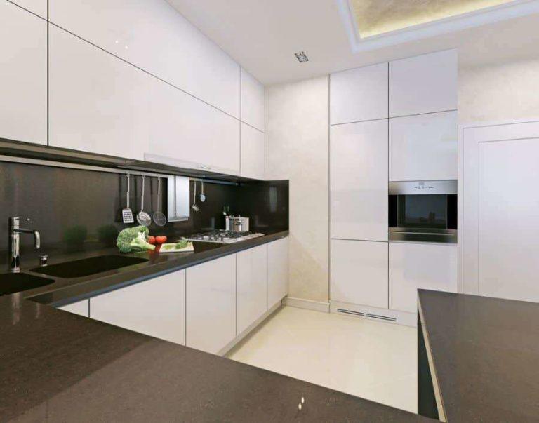
Mat apron is made of MDF, porcelain stoneware or ceramic tiles, but with a matte surface. Glass apron can also be matte. What is better not to use? Plastic and photoprinting. In principle, there are such options, but they are at the junction of styles. Achieve harmony is not always possible.
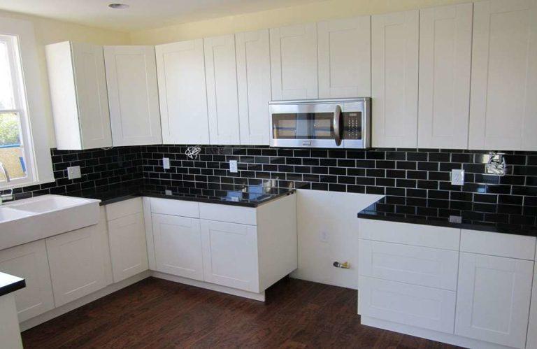
If the facades are matte, the apron can be shiny. It is not necessary, but it looks interesting. Another of the techniques you see in the photo above. Brick tiles with contrasting finishes revitalize well and, at the same time, not much mottling.
Black technique as accents
We will get a revitalizing effect if we build black appliances into the white set. You don’t have to look for a black refrigerator. Even if you find one, it will look too massive. Alternatively, you can find a refrigerator with blued steel doors or install a built-in one with overlapping fronts. Other appliances with black doors are not a problem to find.
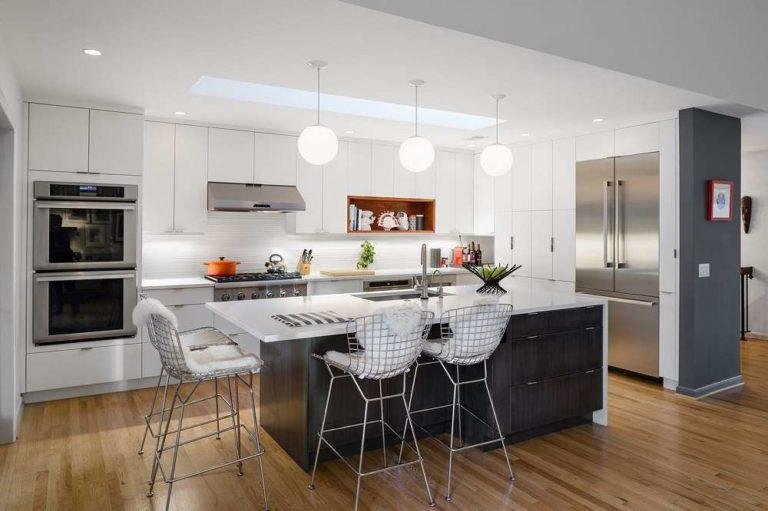
Often the problem of selecting appliances is solved by choosing combined facades – black glass in a metal frame. This is almost a classic design option.
What should be the tabletop
One of the common solutions is to install a black countertop to white furniture. Visually it looks interesting. Dark is not too much, the interior turns out balanced, bright, does not “load”.
A few words about what to do with the sink for the kitchen. Ideally, it is selected under the color of the countertop. The second suitable type of sink is from stainless steel. If there are no other shiny details, so that the sink is not knocked out of the picture, give preference to matte or blackened steel.
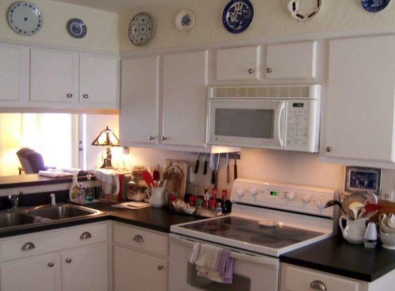
Contrary to popular belief, white fronts are not that hard to care for. With dark or colored ones there is more trouble. With white fronts, you only need to remove stains and stains immediately. In emergencies, “colored” stains can be discolored with bleach or bleach.
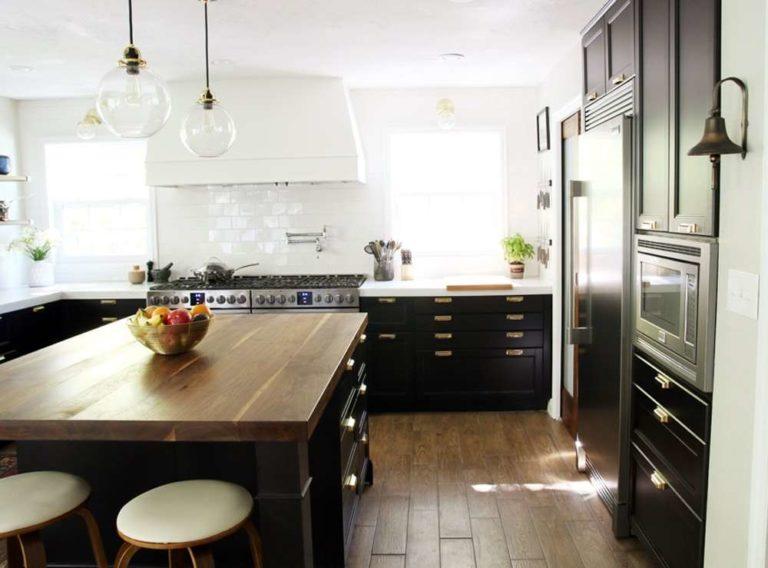
Effectively revitalizes white kitchen furniture with a wooden countertop. This will work if you want to get a cozy atmosphere. Dark or light is suitable. Wood of any color gives that warmth, which is lacking in the black and white design.
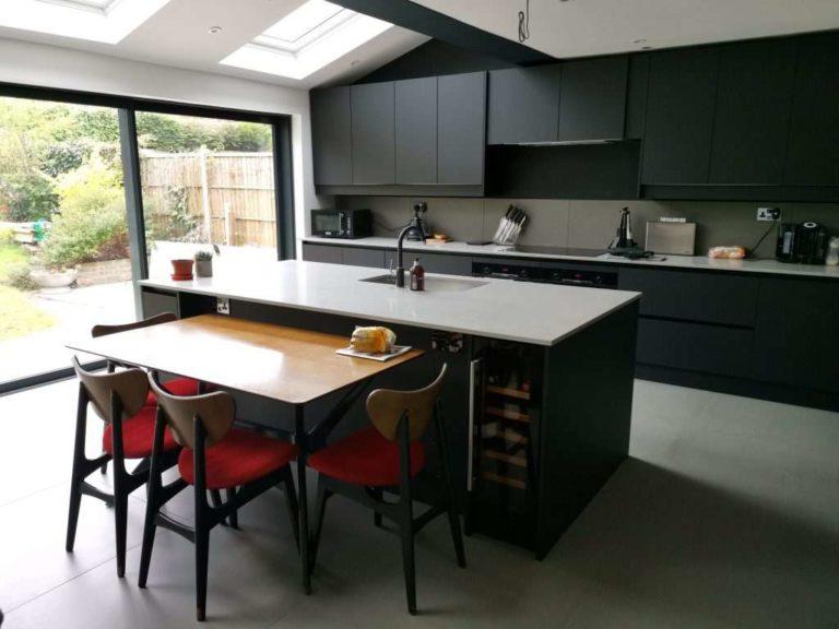
To avoid spoiling the impression, make the floor the same “wooden” color. If you want, find chairs of the same color. In fact, wooden details bring additional color, dispersing, softening monochrome. About other color accents will be discussed further.
What to add: colors and accents
The idea of using two pure colors attracts many people, but not satisfied with the “sterility” of the interior. In this case, add colored details. Since both main colors are neutral, the choice of additional is not limited. But if you want coziness, choose a warm shade. Above is an example of a monochromatic kitchen with wooden details. Often add more red or green, as in the photo below.
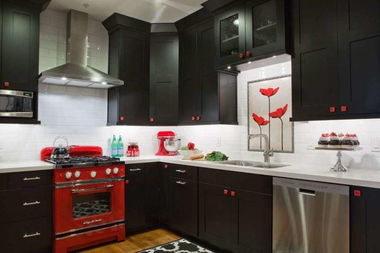
Red revitalizes even blackness, but not cold tones. And clean, warm shades. This is not the case when using pastel paints or color with a gray patina. Clean tones in the warm part of the spectrum are needed to add energy, warmth.
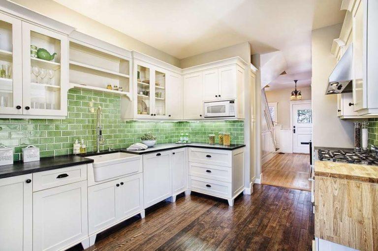
Another color that is often “diluted” with this combination is green. Use dark green or grassy green. Light shades do not give warmth. For our purpose, saturated, pure colors are better.
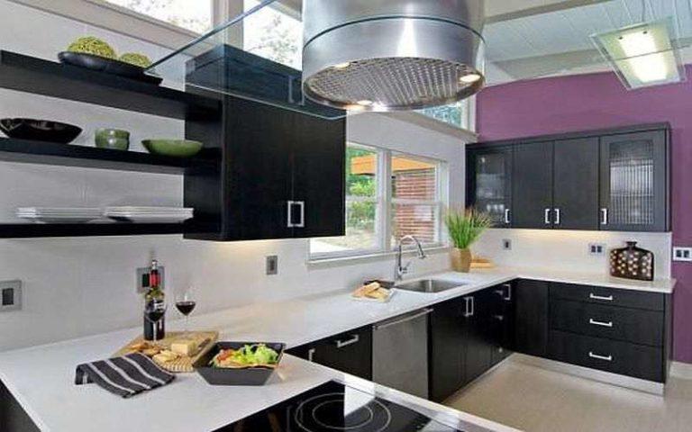
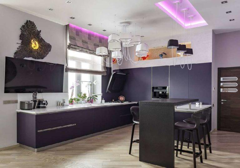
The next color to revitalize the decor of the kitchen – warm tones of the purple range. But be careful with them: it is easy to darken the interior, especially if the furniture is black. In the photo above there is a lot of light and the impression is pleasant. In the photo below we see a characteristic mistake – too dark, which creates a gloomy impression.
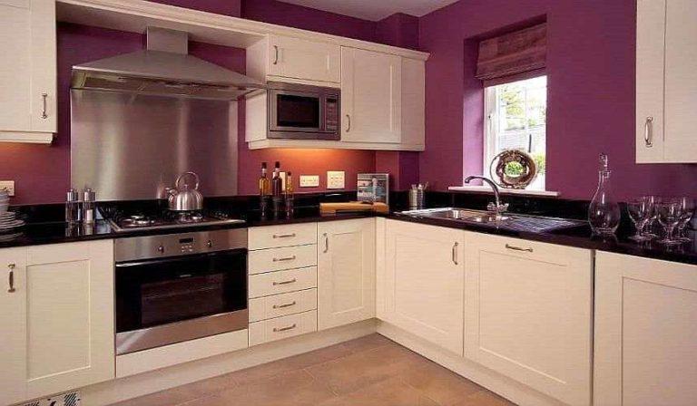
Here the mistake is that the color used is dark. In addition, there is a lot of it. Even a light-colored headset does not save the situation. If on the facades used material with gloss, the impression would be different. And for this particular case, the salvation in repainting the wall near the window in white. As an option – add a small amount of tint to get a pinkish shade.
Curtains for monochrome interior
The choice of the type of curtains depends on the chosen style. In minimalism, the direction of techno, most of the modern styles use:
- roller blinds,
- horizontal or vertical blinds.
A slightly “softer” option – Roman blinds with varieties. For styles of ethnic direction is possible any type, including flounces, ruffles, ruffles. The matter of taste, preferences.
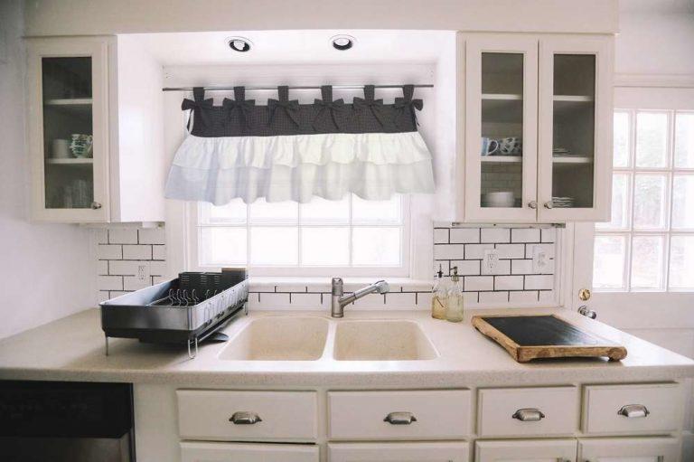
Now a little about color. If you do not use any color additions, then the curtains can be in the same range. Monochrome or with a pattern – at your discretion.
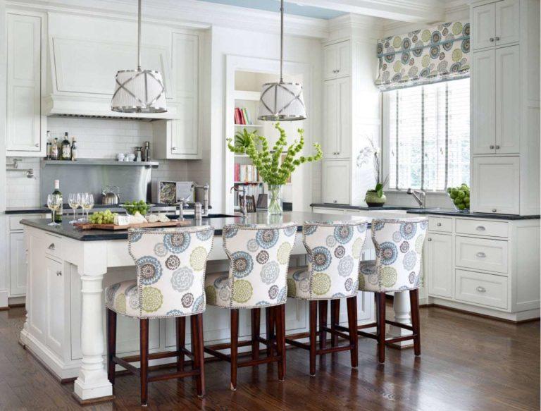
The nature of the pattern depends on the style. For restrained interiors and modern trends are suitable for graphic and geometric motifs. For others – any, including floral or vegetable prints.
