Purple kitchen, with the right choice of colors and verified balance, will please and give a good mood for a long time. Just need to know with what colors can be combined colors of this range and how to achieve harmony.
Conteúdo do artigo
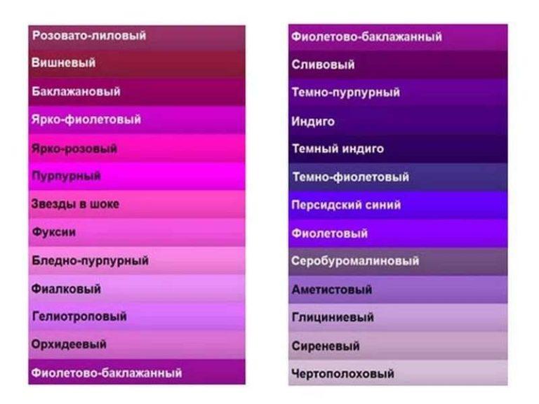
With what colors to combine purple in the kitchen interior
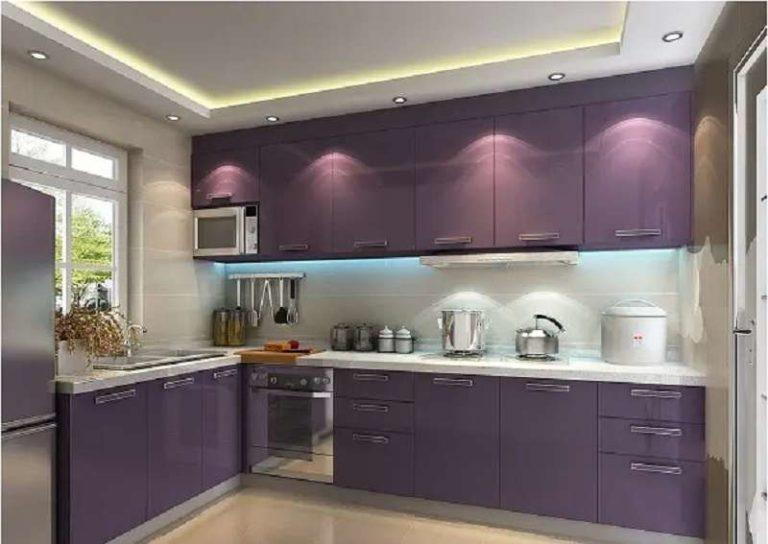
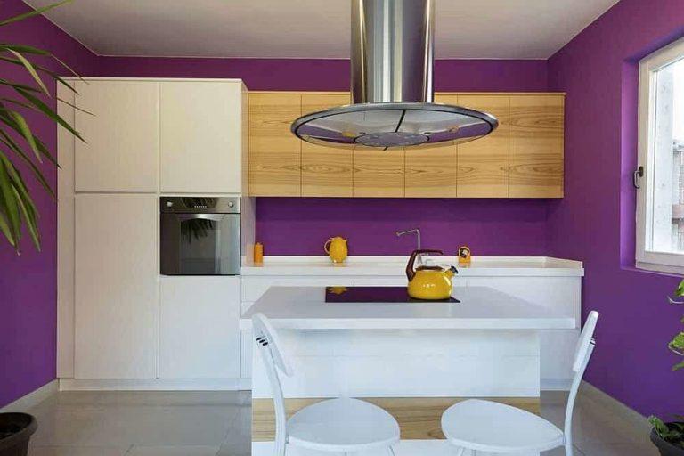
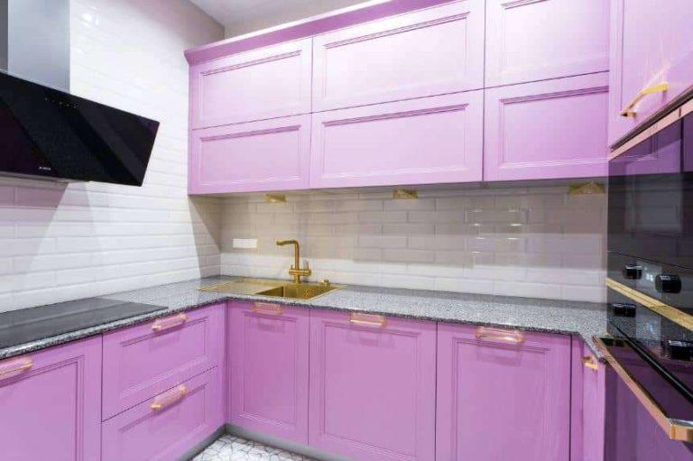
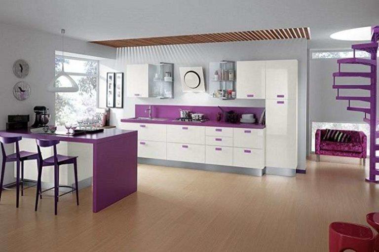
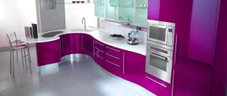
Purple is a bright and expressive color. To make the interior was harmonious, “solo” color can be only one. If you want to use a bright and saturated shade of the purple range, then all the others should be neutral (white or gray) or light, blurred. They should only be the background. Approximately as in the photo below.
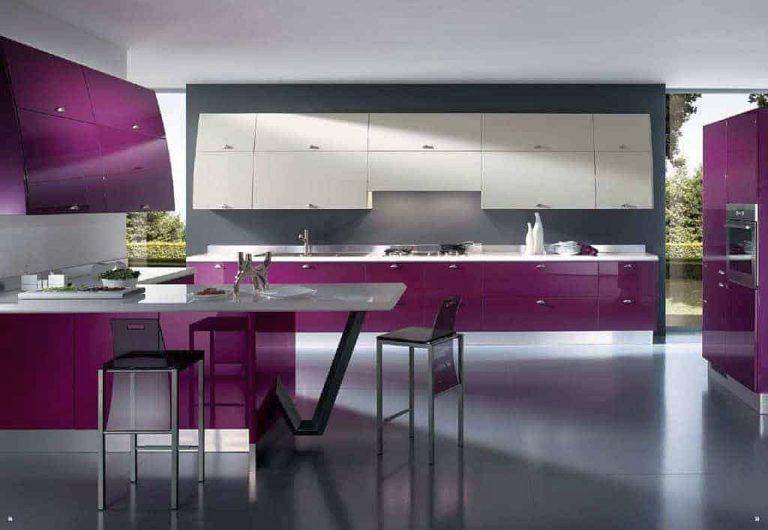
Even not the brightest shades of this color are very demanding to combinations. With this color it is easy to overload the interior. To prevent this from happening, everything that is not purple should be gray, white, beige and their shades.
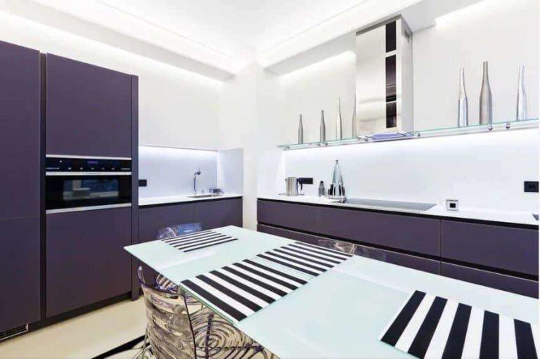
You can still use very light tones of the same range, or combined. For example, light soft pink with a light grayish patina as in the photo below. The color of the garniture is barely noticeably different from white. There is only a hint of pinkish-lilac. This is what emphasizes the lilac walls and harmonizes the interior.

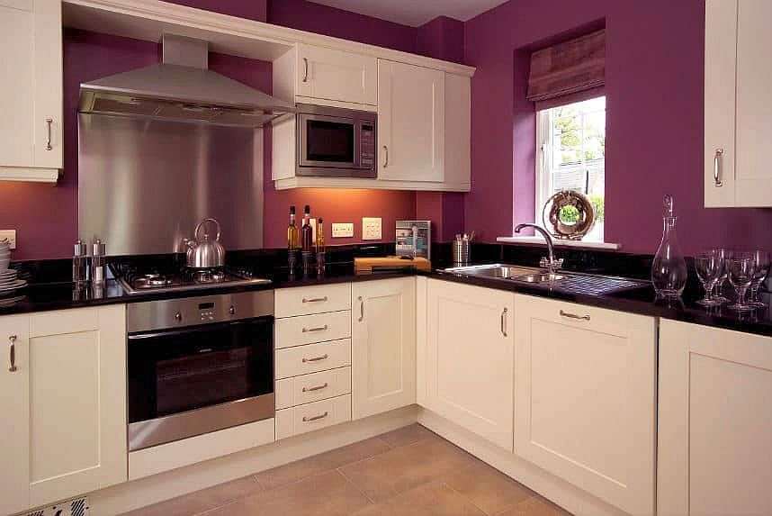
If you want to follow this example – to make bright walls and light furniture with black countertops, then the color of the facades take based on the color of the walls. If they will be a cold shade, then make the facade on the basis of the same color, but very much lightened.
What colors to add except for the basic colors
In general, except for white and gray, purple and lilac are well combined with green (grass) and the color of wood. The floor, if it is not light, make a “wooden” color. It adds the missing warmth.
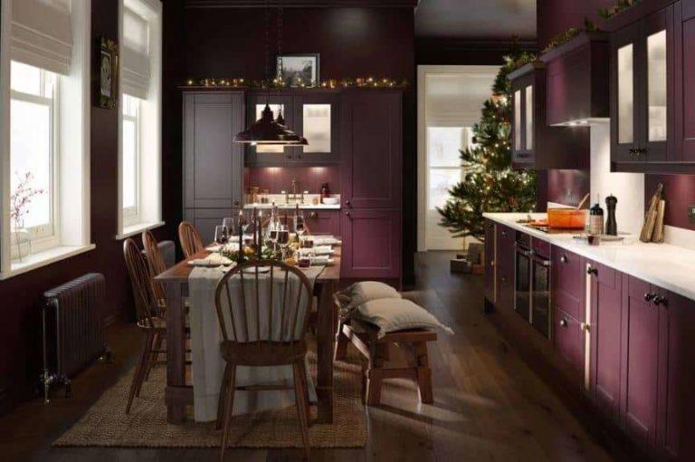
And greenery is more often present in the form of flowers. Very rarely a few green additions are added. The slightest overshoot turns even a harmonious interior into a complete turmoil.
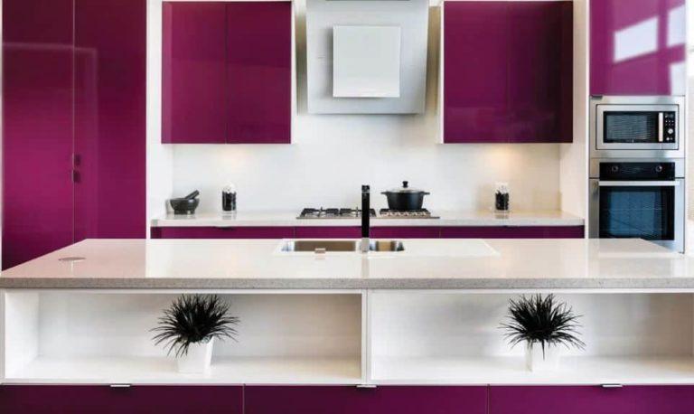
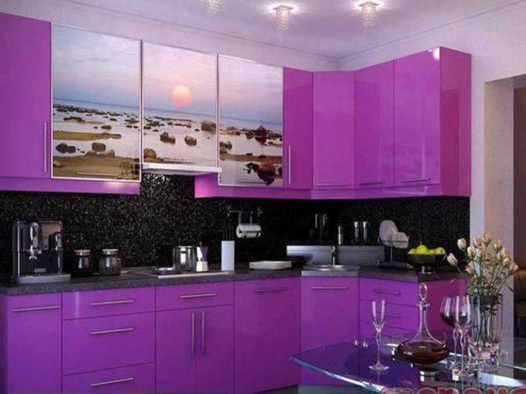
Black will also refer to additional. It should not be a lot. The black color attracts attention, dragging it to itself. This is what we see in the photo above and below.
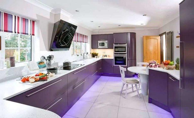
Pay attention: the less black, the “lighter” the interior.
This is true for all dark colors that you add to purple. They strongly darken the picture and shift the accents. If you want to favor lilac or purple, do not add anything dark. Darkening is one of the most common mistakes when working with this color.
How much purple is too much purple
As already said, purple is a bright and eye-catching color. But it can not be made dominant, that is, it should not be a lot.
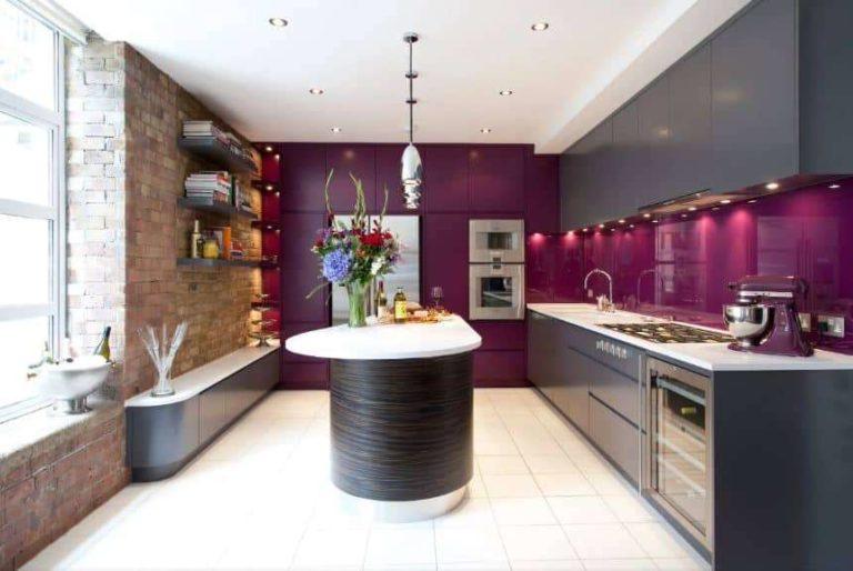
You can make a purple garniture or purple walls. What can you add to them? Chairs of the same color or textiles on the windows in the same range – no more. Other – neutral colors – should take up more space than you’ll allocate to lilac or purple. Even if it’s a light mauve.
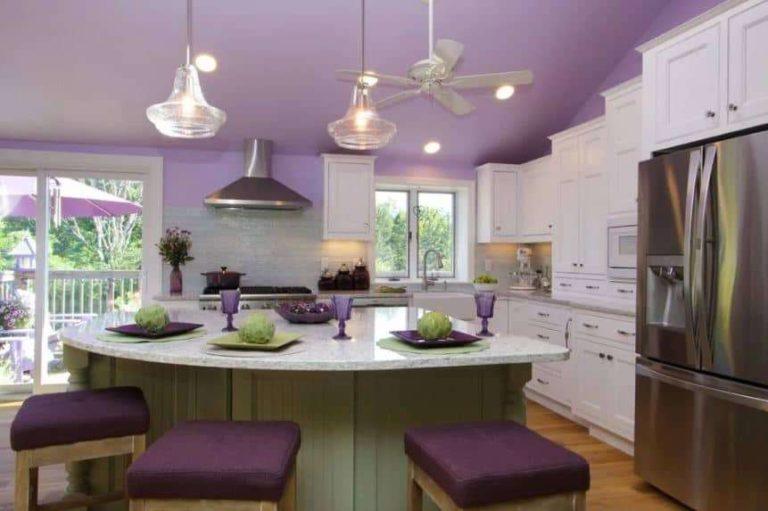
Example in the photo above. This is a non-standard solution: a colored ceiling is made – light purple, which is shaded by darker furniture upholstery and some details in the interior. Everything else is white and only the floor has a warm yellowish tint. And the base of the table has a light pistachio shade. It is he who makes the atmosphere more cozy, softening the pure shade of white in the fronts.
How to use purple in small kitchens
If you plan an interior for a small kitchen, it is better to use blurred pastel shades. For bright and saturated need space, otherwise they will “squeeze” the already small volume.
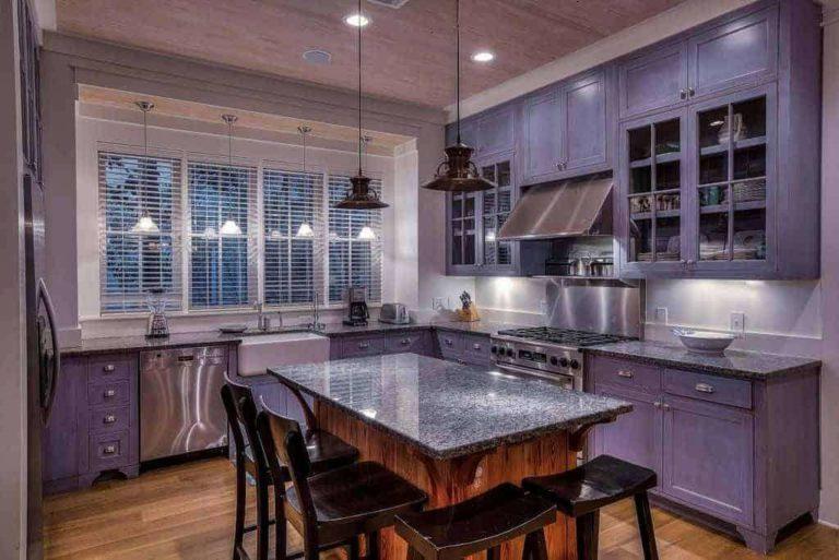
If you make in a small kitchen lilac only the doors of the headset, they will occupy a large share. For other colors will remain not much space. If all the furniture will be dark and bright, the room will seem even smaller.
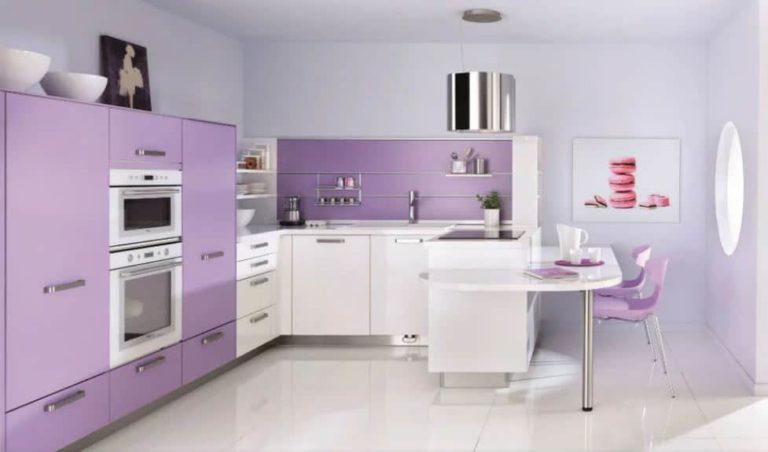
This is one of the reasons why part of the furniture is made white, even in large spaces. Part of the kitchen furniture fronts, top or bottom, are made colored and part of the fronts are made white, gray or beige.
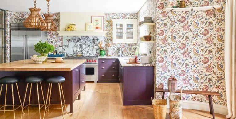
Another point: purple and lilac look good only with enough light. It can be natural or artificial, but there should be plenty of it. Even light shades or a small number of details in this range require bright lighting. Look for yourself – in every photo the light is concentrated on the purple part. Wherever it is: on the furniture, walls or ceiling.
What styles purple is suitable for
As soon as we talk about a lilac kitchen, a picture in the Provence style appears in the imagination. But in our country it is not so popular, and furniture in this style is not so much. To make it to order will be expensive – a lot of details, higher complexity of work, higher price.
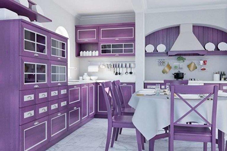
Purple and lilac are great for modern style. And both in a matte version, and in gloss. And the simpler the facade, the more attention is drawn to the color.
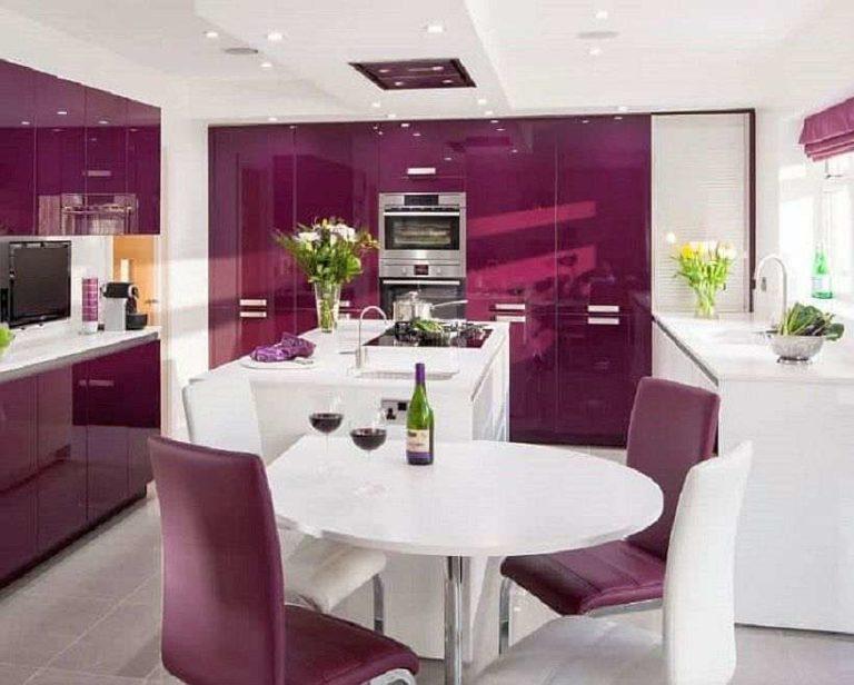
Glossy facades due to glare and reflection break the perception of space. Small rooms look bigger. But the furniture needs more care. Especially if it is a bright saturated color.
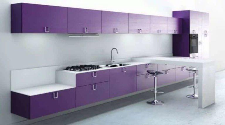
Matte kitchen facades are not demanding in terms of care. In lilac, purple, plum look stunning. Clear simple lines do not require special skill from furniture makers – even on order, such facades will not be too expensive.
If you like more bright and non-standard solutions, combine purple furniture with warm shades on the walls.
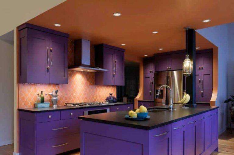
In the photo above, the ceiling has the same color as the walls. But there is a lot of light needed. In addition to ceiling lighting will be required and lighting of the working area, and each.
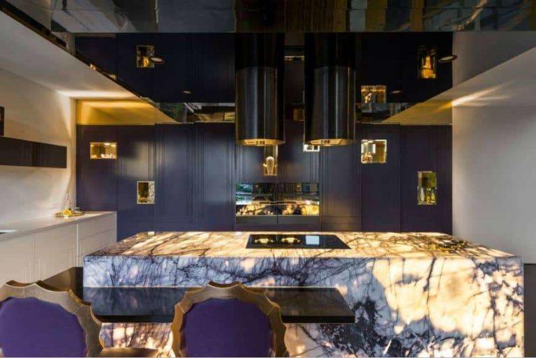
In the photo above, the interior is on the verge of art nouveau and luxury style. Or rather, it is a mix of these styles. Dark purple ceiling and facade compensates for the sea of light and white color of all other objects. The exception is the marble table, which has veins of the same color. It was the marble that served as the basis for the choice of color.
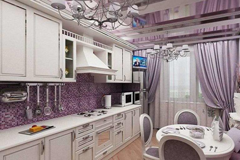
The next photo is no less interesting option, but in a different style. It is also closer to “luxury”, but with Provencal notes.
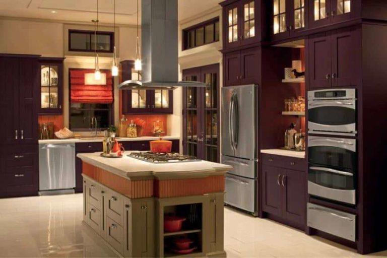
A certain country style is also felt here. The saturated color is diluted with steel-gray. In general, this combination always wins. With any color from the lilac-purple range. This is that rare case when to lilac added also pink-red.
Photo for inspiration
